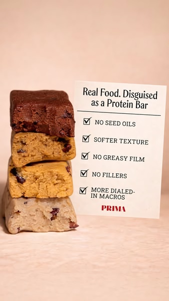
A vertical 9:16 image displaying a stack of protein bars next to a checklist that highlights key health and texture benefits.
Free credits included. No card required
This protein bar ad creative leverages a clean, high-contrast visual hierarchy to communicate value through a simple checklist format. By isolating the product against a neutral, warm background and presenting a direct comparison of benefits, the ad eliminates cognitive load for the viewer, ensuring the core value proposition is processed instantly during a fast-paced mobile scroll. The primary driver of performance here is the deliberate alignment of visual simplicity with a benefit-rich, problem-solving list that quickly builds trust.
For most performance marketers, this structure works because it avoids the noise of cluttered lifestyle photography and focuses entirely on ingredient integrity. You can replicate this systematic approach to product positioning using Promer AI to maintain the same level of clarity and brand focus across your ad sets. While success depends on your specific customer segment, this logic typically drives higher engagement when testing health-conscious angles against crowded market spaces.
A winning ad is built on a clear, persuasive structure that tells the viewer exactly why your product belongs in their pantry.
Pro tip
When using a checklist hook for a food product, ensure every bullet point addresses a specific 'fear' or 'objection' commonly cited in your niche. A checklist is most effective when it explicitly eliminates the top three reasons a customer might walk away from a competitor.









.png)
Promer helps you find the pattern, adapt it to your product, and create your own version in minutes.






