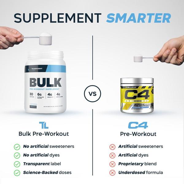
A square 1:1 side-by-side comparison creative featuring two pre-workout supplement containers, highlighting ingredient transparency for one vs. the other.
Free credits included. No card required
This pre-workout ad creative leverages a classic comparison structure to immediately establish the value of the featured brand. By placing the product side-by-side with a competitor and using green checkmarks versus red x marks, the creative forces an instant, rational assessment that highlights ingredient purity.
This pattern is effective because it removes ambiguity and uses visual shorthand to communicate complex product benefits quickly. For teams looking to emulate this high-converting format, Promer AI allows you to define these comparative visual elements while ensuring your own product data remains the central focus for your audience.
Effective product differentiation starts by mapping out the specific traits that make your offering objectively superior to the status quo.
Pro tip
When building a comparison creative, always ensure your list of attributes aligns with what your target customer cares about most, such as ingredient transparency or dosage accuracy. A comparison is only as strong as the points you choose to highlight, so focus on the specific pain points your current audience is actively trying to avoid.









.png)
Promer helps you find the pattern, adapt it to your product, and create your own version in minutes.






