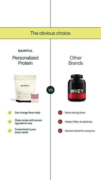
A split-screen comparison creative that contrasts a personalized nutrition brand against generic alternatives using a clean, icon-based table.
Free credits included. No card required
This Personalized Protein ad creative leverages a logical comparison hook to immediately establish perceived value by contrasting the brand with generic market alternatives. By visually pitting the specific benefits of personalization against the limitations of mass-market products, the creative builds an irrefutable case for the consumer's switch.
Structure is the backbone of high-converting ads, and for most ecommerce teams, a clear split-screen layout is a reliable performer. Using Promer AI, advertisers can quickly adapt this competitive positioning to their own product category without starting from a blank canvas, ensuring their unique value propositions are clearly articulated.
A powerful ad creative does not need to shout; it simply needs to lay out the logic so clearly that the audience makes the decision for themselves.
Pro tip
When designing a comparison chart, ensure your brand's unique benefit aligns perfectly with a specific competitor drawback to create a high-contrast visual. For most brands, focusing on just three key differentiators prevents the graphic from becoming too busy for a 9:16 mobile display.













.png)
Promer helps you find the pattern, adapt it to your product, and create your own version in minutes.






