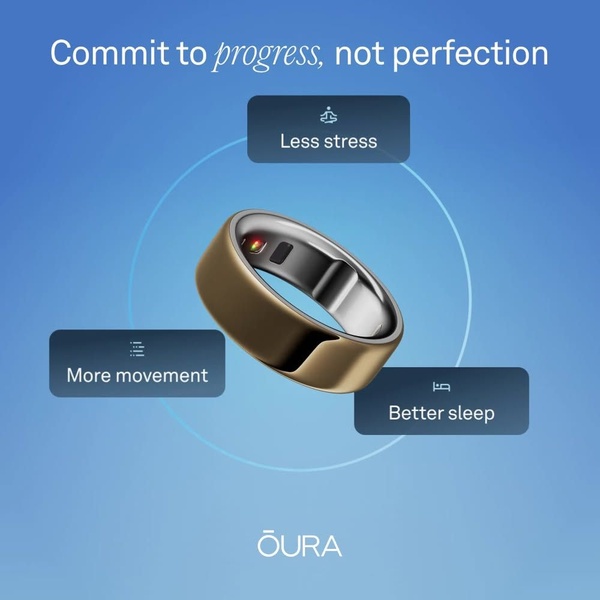
A clean, minimalist 1:1 square ad showcasing an Oura ring centered against a soft gradient background with three key benefit pillars labeled around it.
Free credits included. No card required
This Oura ring ad creative leverages an aspirational, minimalist layout to strip away the complexity of health monitoring. By framing the product as a partner in personal growth rather than a technical gadget, it effectively lowers the barrier to entry for potential users who might feel overwhelmed by data-heavy alternatives. The clean, balanced aesthetic combined with a positive, non-judgmental headline creates an immediate sense of emotional relief.
This structure works for most wellness-focused brands because it prioritizes outcomes over raw specifications, a core strategy for high-converting Promer AI users looking to simplify their value proposition. By using a clear visual circle to group the benefits, the design directs the eye naturally toward the ring itself. In most cases, focusing on a single, compelling lifestyle benefit is more effective than listing every technical feature at once.
Great ads start from an idea, a feeling, or a structure, rather than just filling a blank design.
Pro tip
When replicating this structure, use icons that are consistent in weight and style for your three benefit pillars to maintain the professional, minimalist look. If your brand offers more than three benefits, resist the urge to add more labels; stick to the three that provide the highest immediate emotional impact to maintain the scroll-stopping clarity of the ad.







.png)
Promer helps you find the pattern, adapt it to your product, and create your own version in minutes.






