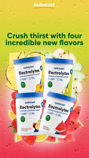
This ad highlights four new electrolyte powder flavors using a vibrant, water-splashed background to emphasize refreshment and hydration.
Free credits included. No card required
This electrolyte powder ad creative succeeds by pairing a clear, benefit-oriented hook with high-contrast, refreshing visual elements that demand attention. By centering the product lineup against a moisture-rich background, the brand uses visual association to instantly communicate the product's hydration promise before the user even reads the headline.
For most brands in the supplement space, clear product visibility combined with a focused benefit statement creates a stronger performance baseline than complex graphics. You can replicate this structural layout using Promer AI to swap these brand assets with your own high-resolution product imagery while keeping the high-converting, flavor-forward layout intact.
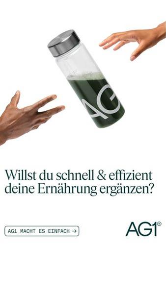
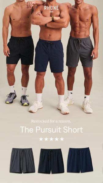
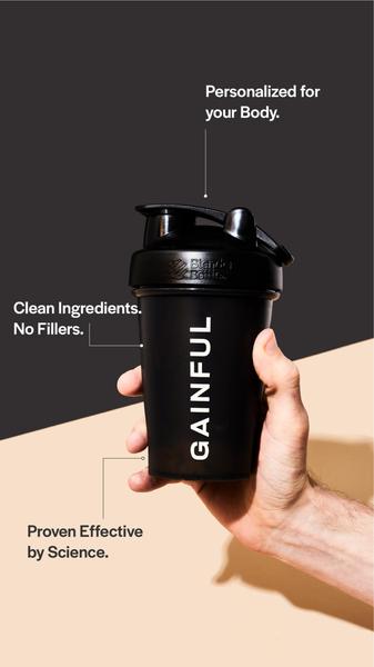
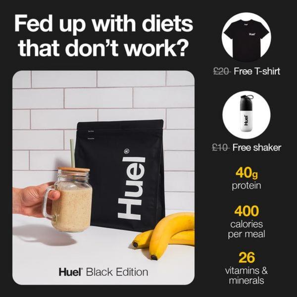
Effective product ads rely on a clean visual hierarchy that bridges the gap between your brand aesthetic and the specific problem your product solves.
Pro tip
When showcasing multiple flavors, ensure your background assets complement the packaging colors without overwhelming the product. Use this layout to highlight a 'new collection' or 'variety pack' by varying the scale of the fruits shown around the tubs to create depth.





.png)
Promer helps you find the pattern, adapt it to your product, and create your own version in minutes.






