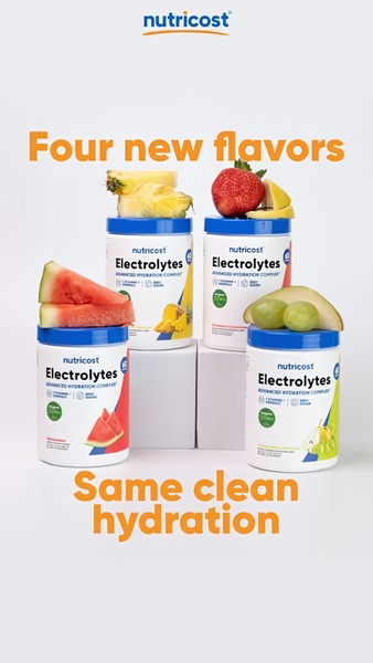
A minimalist studio-shot showcasing four Nutricost electrolyte drink containers, each topped with fresh fruit slices representing the flavor profile.
Free credits included. No card required
This electrolyte drink ad creative leverages a clean, high-key studio aesthetic to signal product purity and transparency. By pairing the four product containers directly with their fresh fruit source material, the design instantly communicates the core benefit and flavor variety without requiring complex copy. This strategy works because it respects the user's need for immediate clarity while browsing busy mobile feeds.
For most ecommerce brands, simplifying the visual hierarchy of a product launch is the fastest way to drive engagement. Using Promer AI allows teams to replicate this balanced, minimalist structure, ensuring their own product shots achieve the same professional, scroll-stopping quality without costly production cycles.
Great ads start from a clear visual structure that prioritizes the product truth over decorative design choices.
Pro tip
When launching multiple flavors, use a symmetrical grouping strategy to create a sense of order and abundance. This technique works best when your packaging design is uniform, as it emphasizes your brand's consistency while highlighting the unique differences through secondary visual cues like fresh fruit.




.png)
Promer helps you find the pattern, adapt it to your product, and create your own version in minutes.






