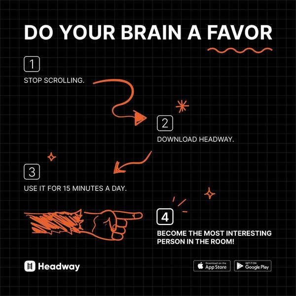
A square-ratio ad for an educational app that uses a hand-drawn, four-step visual process to guide the user toward a specific CTA.
Free credits included. No card required
This educational app ad creative relies on a directive, step-by-step visual hook that interrupts the scrolling behavior of a user by imposing a clear, low-friction path to value. By combining a minimalist grid aesthetic with hand-drawn, high-contrast orange annotations, the creative creates a sense of urgent simplicity that feels both accessible and authoritative.
Following this logic, brands can use Promer AI to build similar instructional layouts that convert abstract benefits into actionable user journeys. For most ecommerce teams, stripping away unnecessary imagery in favor of pure, text-heavy process maps helps reduce cognitive load, making the conversion path feel like a logical conclusion rather than a sales pitch.
Great ads start from an idea, a feeling, or a structure, not a blank design.
Pro tip
Instead of focusing on features, focus on the immediate psychological benefit of the final step. Use hand-drawn elements to keep the brand voice feeling human and approachable despite the rigid, step-by-step format.















.png)

Promer helps you find the pattern, adapt it to your product, and create your own version in minutes.






