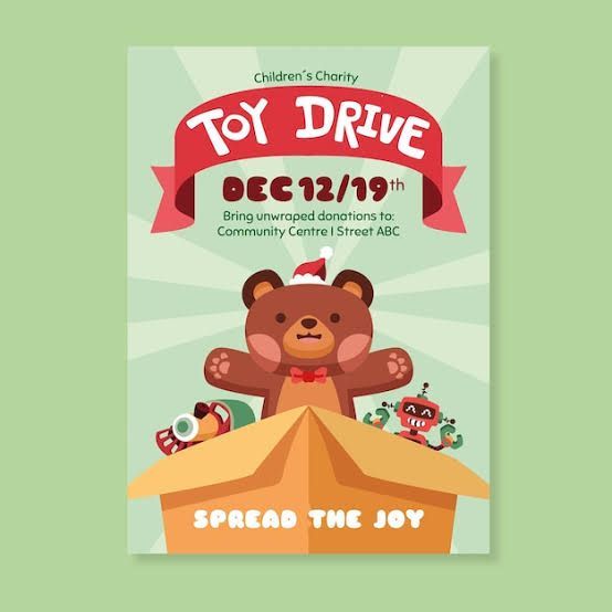
A festive, illustrated poster design for a community toy drive featuring a bear and holiday-themed graphics.
Free credits included. No card required
This toy drive flyer succeeds by using a warm, approachable illustration style to convey a sense of community goodwill. By centering a friendly character within a clear, uncluttered layout, the visual immediately communicates the event’s purpose without overwhelming the reader with dense information. The effective use of festive color-coding and high-contrast typography ensures that the event dates and location remain the focal points for the audience.
For most organizations, this layout pattern is successful because it prioritizes clarity and emotional connection over complex messaging. Using Promer AI to analyze such structures helps marketers replicate these clean, balanced designs for their own community initiatives. It is important to note that consistent visual framing typically performs better than cluttered alternatives when aiming to drive local participation.
Great ads start from a clear sense of purpose, using simple visuals to guide the audience toward a specific community action.
Pro tip
For community event ads, match your illustration style to the tone of the charity. A hand-drawn or vector approach typically feels more authentic and less corporate, which can lead to higher community trust.



















Promer helps you find the pattern, adapt it to your product, and create your own version in minutes.






