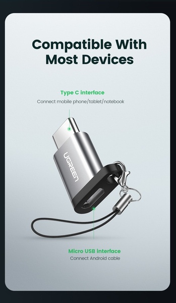
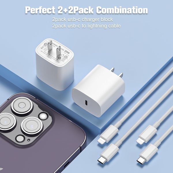
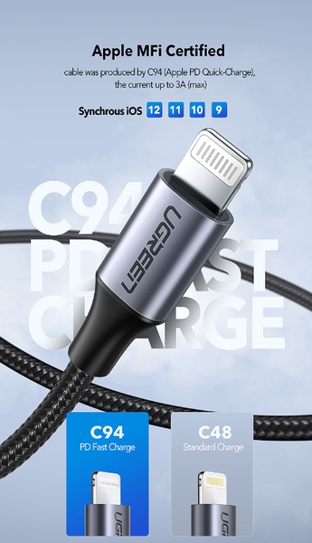
This ad displays a close-up, high-quality product shot of a dual-interface USB adapter with clear call-outs explaining its compatibility.
Free credits included. No card required
The USB adapter ad creative succeeds by stripping away visual clutter to focus exclusively on technical compatibility. By using clean, high-contrast annotation lines, the ad immediately answers the viewer's primary question - what does this connect to - without requiring a video or long-form copy. This clarity-first approach to communication reduces cognitive load for the customer, turning a simple utility product into an obvious solution.
For most ecommerce teams managing high-SKU catalogs, this pattern of direct labeling is highly effective for accessories or functional components. Teams can replicate this structured clarity using Promer AI to ensure their product imagery consistently highlights key benefits. By focusing on the physical interface rather than lifestyle fluff, the ad frames the product as an essential, problem-solving tool rather than an impulse buy.
Great ads start from a singular, clear idea of the customer's technical pain point, not from a desire to fill space with complex design.
Pro tip
When creating technical annotation ads, use a bold, high-contrast accent color like green or yellow that deviates from your primary brand palette. This draws the eye to the connection points specifically, preventing users from ignoring the labels. Always test one variation with minimal text and another with brief benefits to see which resonates more with your specific demographic.





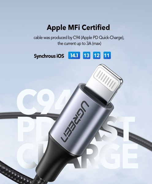



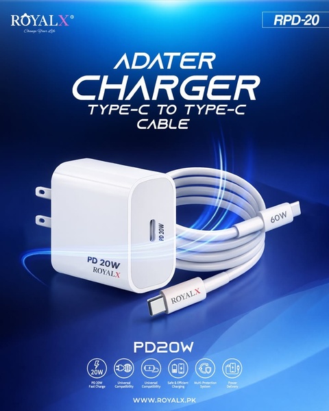


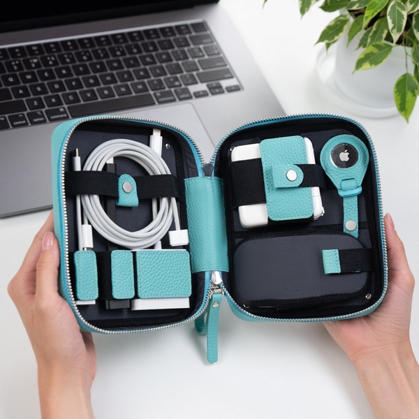




Promer helps you find the pattern, adapt it to your product, and create your own version in minutes.






