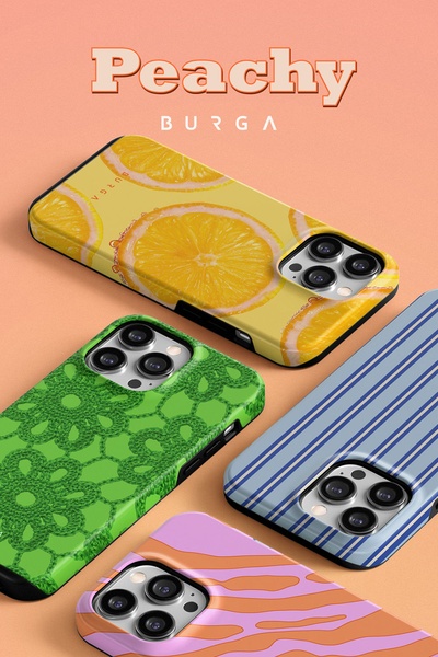
A high-quality studio shot featuring four distinct phone case designs in a vibrant, color-blocked grid arrangement.
Free credits included. No card required
This phone case creative uses a clean, isometric grid layout that instantly communicates variety and style without overloading the viewer with text. The structural decision to group multiple distinct designs creates a sense of abundant choice, effectively acting as a visual catalog that keeps users engaged longer than a single-product shot.
Great product ads often rely on the visual rhythm of a well-organized grid to turn a simple collection into an irresistible must-have.
Pro tip
When using a grid-style layout, ensure your product designs have distinct visual patterns or colors to prevent the creative from looking muddy. This approach works best when you want to showcase variety or upsell multiple SKUs at once.
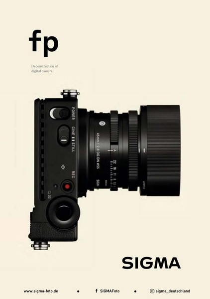
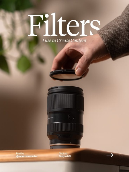


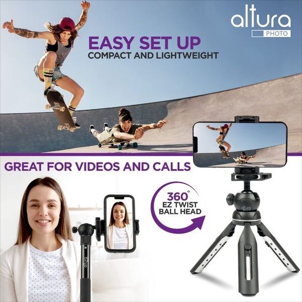
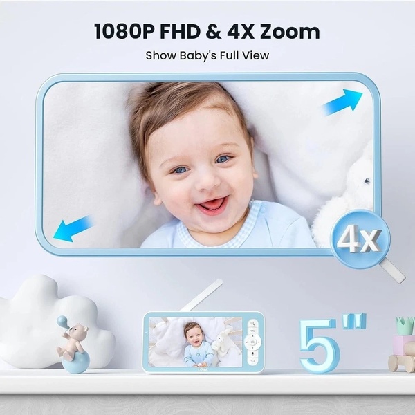
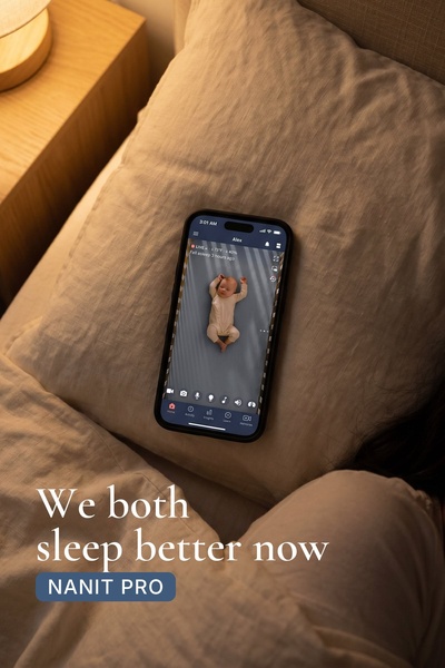

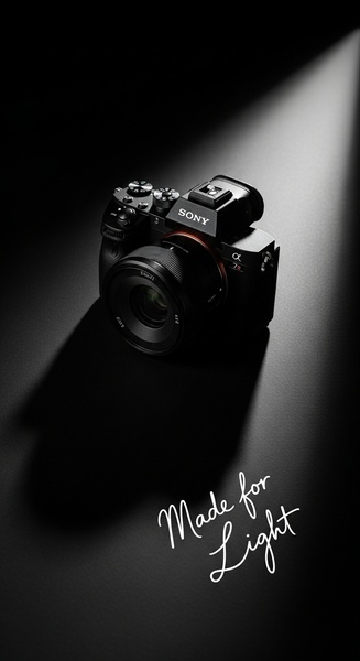
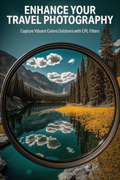
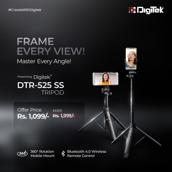

Promer helps you find the pattern, adapt it to your product, and create your own version in minutes.