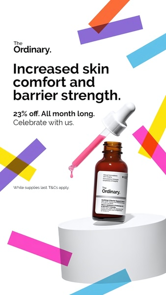
A clean, high-contrast promotional graphic featuring a facial serum product, a bold discount offer, and abstract geometric shapes to highlight brand assets.
Free credits included. No card required
This facial serum ad creative achieves performance by prioritizing a clean, minimalist layout that places the product benefits and sale value front and center. The design uses high-contrast negative space and consistent geometric visual cues to direct the viewer's eye straight from the value proposition to the product image.
For most skincare brands, this approach establishes trust through a clinical, clutter-free aesthetic that differentiates itself from overly busy social media feeds. By using Promer AI to analyze these layout patterns, you can effectively replicate this balance of white space and bold typography for your own product launches and promotional cycles.
Effective product promotion relies on clear communication of value paired with a distraction-free visual environment.
Pro tip
When running benefit-led ads, ensure that your supporting graphic elements align with your primary brand colors to maintain consistency. Using abstract shapes—as seen here—can help fill the vertical space of a 9:16 format without cluttering the main offer message.




















Promer helps you find the pattern, adapt it to your product, and create your own version in minutes.






