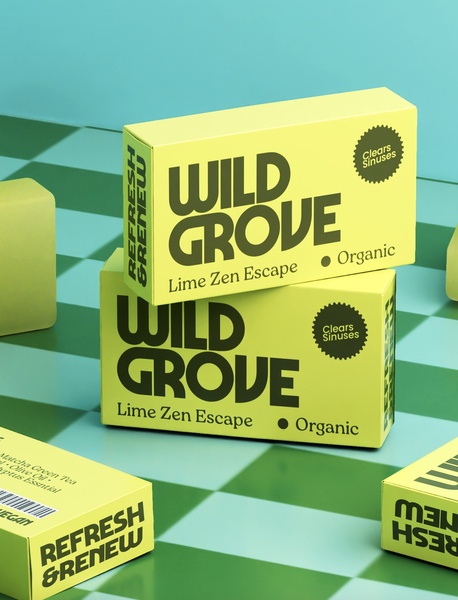
A high-contrast, professional studio shot of multiple cleansing bar boxes arranged on a checkerboard surface to emphasize product design.
Free credits included. No card required
This cleansing bar ad creative uses a bold, monochromatic color palette and clean, symmetrical staging to establish instant product authority. By isolating the product against a stylized checkerboard, it forces the viewer to focus entirely on the brand name and the specific 'Clears Sinuses' value proposition without any surrounding clutter. This visual-led approach leverages negative space and high-contrast typography to create a sense of premium quality that builds trust before the user even reads the packaging details.
For most ecommerce teams, the challenge is conveying efficacy without becoming over-saturated with competing design elements. The structure found here, which you can replicate using Promer AI, works because it treats the packaging as the primary hero, effectively turning a simple functional product into a lifestyle statement that performs well across social feeds.
Great ads start from an idea, a feeling, or a structure, not a blank design.
Pro tip
To mimic this specific level of product authority, ensure your secondary product benefits (like 'Organic' or 'Clears Sinuses') are housed within distinct, simple shapes. This mimics the 'seal of quality' effect, which typically increases perceived trustworthiness for health-adjacent products.




















Promer helps you find the pattern, adapt it to your product, and create your own version in minutes.






