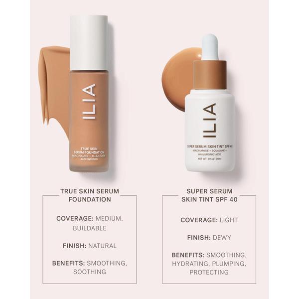
A clean, minimalist 1:1 creative showing two serum foundation products side-by-side with clear breakdown charts for coverage, finish, and benefits.
Free credits included. No card required
This serum foundation ad creative uses a clean, side-by-side comparison to solve the primary customer confusion of choosing between two similar products. By mapping product benefits against distinct finishes and coverage levels in a minimalist layout, the brand removes friction in the decision-making process.
In most cases, for performance marketers, presenting a structured breakdown of product utility performs better than feature-heavy copy because it respects the consumer's time. You can use Promer AI to analyze successful structures like this and apply them to your own product lineup, ensuring your comparison charts are as clear and conversion-focused as this example.
Great ads start from an idea, a feeling, or a structure, not a blank design.
Pro tip
When creating comparison charts, ensure the benefits listed directly address the specific pain points identified in your target persona's stage of the funnel. If a user is looking for a serum foundation, they are likely choosing between 'natural finish' and 'dewy finish', so keep the comparison points strictly tied to those outcome-based desires.




















Promer helps you find the pattern, adapt it to your product, and create your own version in minutes.






