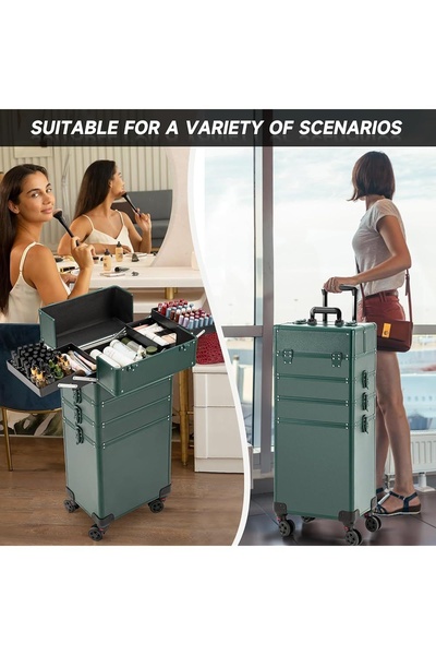
This split-screen ad visualizes the versatility of a makeup train case, showing its use in a home vanity setting and as a portable travel companion.
Free credits included. No card required
The effectiveness of this makeup train case ad creative lies in its clear, split-screen visual structure that immediately establishes product utility across two different environments. By contrasting a stationary home vanity setup with an on-the-go travel scenario, the ad effectively demonstrates that the product is as much a professional storage solution as it is a mobile travel case, removing any ambiguity about its core value proposition. The strategy relies on showing the product in action rather than just displaying it, allowing potential customers to mentally place themselves in both usage contexts simultaneously.
This specific split-screen approach works for a Promer AI user because it anchors the product's benefits directly in relatable, high-intent situations. By highlighting the case's versatility without complex copy, it maintains a clean, professional aesthetic that typically resonates well with audiences looking for both organization and mobility. For most ecommerce teams, this pattern of dual-context storytelling is a reliable way to broaden the appeal of a physical product without relying on heavy text overlays.
Great ads start from an idea, a feeling, or a structure, not a blank design.
Pro tip
When creating a split-screen ad for a product like a makeup train case, use contrasting environments—like home vs. transit—to build the widest possible narrative for the item. Avoid using too much text in the image; let the juxtaposition of the two photos do the heavy lifting of the value proposition.




















Promer helps you find the pattern, adapt it to your product, and create your own version in minutes.






