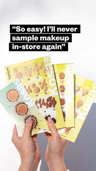
A close-up shot of a user holding multiple makeup sample shade cards, highlighting the ease of shade matching without in-store friction.
Free credits included. No card required
This makeup sample card ad creative relies on a direct, pain-point-focused quote to stop the scroll through pure relatability. By presenting a simple, handheld visual of the product in a bright, natural setting, the ad immediately lowers the barrier to entry for the viewer, framing the product as an accessible solution to the common frustration of in-store shade testing.
For most ecommerce brands, this pattern works because it prioritizes the user's voice over polished, high-budget studio imagery. When you use Promer AI to replicate this structure, you essentially borrow the authority of a satisfied customer's perspective. Focusing on convenience typically outperforms feature-heavy specs, especially for products where color matching and user experience are the primary purchase drivers.
Great ads start from an idea, a feeling, or a structure, not a blank design.
Pro tip
Pair your hook with a specific, customer-validated benefit to increase conversion rates. In the case of makeup products, showing the 'how-to' via a simple, real-life demo often yields better engagement than explaining the formula alone.




















Promer helps you find the pattern, adapt it to your product, and create your own version in minutes.






