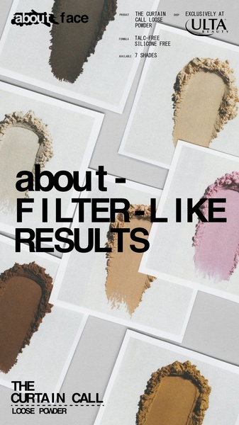
A minimalist, high-contrast ad creative for loose powder, using a grid of product swatches to demonstrate variety and professional finish.
Free credits included. No card required
This loose powder ad creative uses a direct value proposition anchored by a bold, aspirational claim paired with an clean, organized visual swatch layout. By utilizing high-contrast typography over a neutral background, the ad ensures the brand’s promise remains the focal point while allowing the product range to speak for itself through variety. Strategic simplicity allows the viewer to immediately identify the benefit without cognitive overload.
For most ecommerce brands selling cosmetics, showing the actual product texture and range in a structured way builds immediate trust. You can use Promer AI to analyze the structure of this ad and apply similar design principles to your own product range. This approach works because it mimics the aesthetic of professional beauty content while keeping the barrier to purchase low through clear, readable text.
Great ads start from a clear structure that lets the product demonstrate its own value, rather than relying on complex production.
Pro tip
When using a grid-based swatch layout, ensure your product texture is captured in natural, high-resolution lighting to highlight quality. Use the negative space between your swatches to keep the overall look clean, which helps the ad stand out against more cluttered competitor content in the feed.




















Promer helps you find the pattern, adapt it to your product, and create your own version in minutes.






