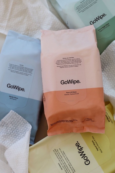
A high-angle flatlay showing various GoWipe product packs on a neutral, textured surface, highlighting ingredient purity and brand variety.
Free credits included. No card required
This Face Wipes ad creative utilizes a minimalist flatlay strategy to communicate product purity through a soft, pastel-focused color palette. By arranging the multiple packaging variations in a structured, top-down view, the ad creates an immediate perception of an organized, high-quality product line while keeping the focus entirely on the product aesthetics.
This approach works because it minimizes cognitive load, allowing the viewer to process the brand's versatility instantly. Using Promer AI to replicate this clean visual hierarchy helps ecommerce teams test product-centric assets without complex setups, though performance outcomes will always depend on your specific audience targeting and product market fit.
Effective product visuals start from a cohesive brand color story that communicates your product's core value before the consumer reads a single word of copy.
Pro tip
When using flatlays for your ads, ensure the product packaging labels are oriented toward the light source to minimize reflections on plastic surfaces. This subtle adjustment keeps your branding crisp and prevents the "cheap" look often caused by inconsistent lighting.




















Promer helps you find the pattern, adapt it to your product, and create your own version in minutes.






