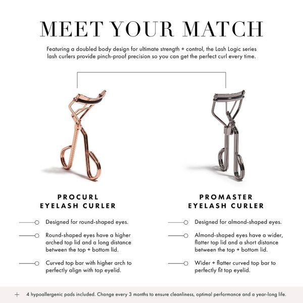
A side-by-side comparison of two specialized lash curlers, highlighting their distinct design features for different eye shapes.
Free credits included. No card required
This eyelash curler ad creative succeeds by leveraging a clear side-by-side comparison to simplify the buying journey. By anchoring the creative on specific user needs—round versus almond eye shapes—the brand builds immediate trust through relevant education rather than generic promises. This strategy segments the audience while providing a tangible reason to choose one variant over another based on anatomical fit.
For most ecommerce brands, adopting this visual logic inside Promer AI can help demystify complex product catalogs. By mapping specific product attributes to customer pain points, you create an intuitive decision-making environment that typically improves conversion rates by reducing analysis paralysis.
Great ads start from an idea, a feeling, or a structure, not a blank design.
Pro tip
When using a comparison framework for cosmetic tools, always highlight the 'why' behind the design difference. Ensure your text clearly links the physical feature, such as the arched bar, to the functional benefit, like the pinch-proof precision, to anchor the customer's choice in logic.




















Promer helps you find the pattern, adapt it to your product, and create your own version in minutes.






