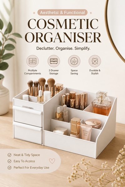
A clean, minimalist product photograph of a white multi-compartment cosmetic organiser displaying beauty products on a wooden surface.
Free credits included. No card required
This Cosmetic Organiser ad creative uses a clean, minimalist studio-style aesthetic to immediately signal order and simplicity to the viewer. The core strategy relies on visual clarity and structured benefit-led copy to position the product as an essential tool for reducing daily chaos. By placing the object on a neutral surface with soft, natural lighting, the ad creates an aspirational vibe that directly connects with the user's desire for a tidy space. This pattern works well for home goods because it removes all clutter from the frame, allowing the potential customer to focus entirely on the product features and utility. For ecommerce teams looking to achieve a similar balance of form and function, Promer AI offers tools to standardize your brand visuals, ensuring your assets remain professional even as you scale your ad testing.
Great ads start from an idea, a feeling, or a structure, not a blank design.
Pro tip
To boost engagement on this style of creative, place your most important feature icon slightly larger than the rest to create a visual hierarchy. This prevents the viewer from feeling overwhelmed by the list of benefits and anchors their attention on your primary selling point.




















Promer helps you find the pattern, adapt it to your product, and create your own version in minutes.






