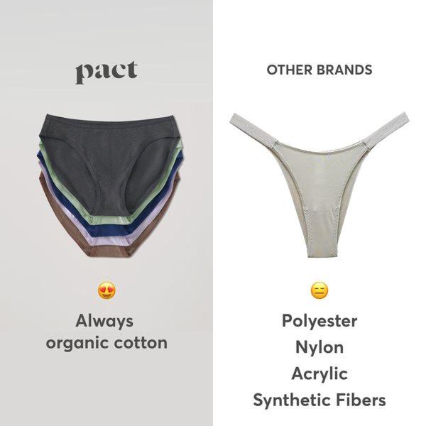
A split-screen graphic visually comparing a pack of organic cotton underwear against a single synthetic thong to illustrate material quality and volume differences.
Free credits included. No card required
This underwear ad creative relies on a clinical split-screen layout to frame the brand as the logical, superior choice against market incumbents. By pairing a high-volume, multi-color product shot with a single, unappealing item from 'other brands,' the design uses visual contrast to make the benefit of organic cotton instantly intuitive.
This pattern works because it removes the need for long-form explanation, allowing the viewer to grasp the value proposition in a single glance. Performance marketers often use Promer AI to test similar comparison frameworks when they need to cut through the noise of crowded markets where material quality is a primary driver of purchase intent.
A powerful advertisement doesn't need complex motion; it only needs to make the right choice feel obvious.
Pro tip
When using a split-screen comparative hook, ensure your product side is significantly more visually appealing than the competitor side. If the quality difference isn't visually immediate, add a bulleted list of 2-3 specific features that differentiate your material composition.




.png)
.png)








.png)




Promer helps you find the pattern, adapt it to your product, and create your own version in minutes.






