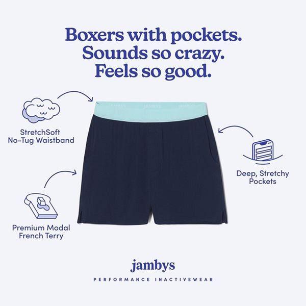
A clean, minimalist layout highlighting three distinct product features: waistband comfort, pocket functionality, and fabric quality.
Free credits included. No card required
This boxers with pockets ad creative succeeds by pairing an unexpected, curiosity-piquing headline with a clear, label-driven visual structure. By positioning a mundane product in a minimalist light, it uses annotated callouts to bridge the gap between product feature and tangible benefit for the customer immediately. Using Promer AI to replicate this structure allows brands to highlight unique selling points without cluttering the screen.
For most apparel teams, focusing on specific product utility in a clean layout prevents cognitive overload and keeps the focus on the item itself. When the visual is stark and the text is benefit-oriented, performance often improves because the user understands the "why" behind the purchase in under two seconds. This approach is highly repeatable for any product category where specific functional details serve as the primary driver for a conversion.
Effective product communication relies on clear visual evidence paired with a value-driven hook that justifies the product existence.
Pro tip
When using this layout, test different iconography for each callout to see which visual shorthand resonates best with your audience. Sometimes a literal icon like a mobile phone inside a pocket is more persuasive than an abstract symbol for fabric quality.




.png)
.png)



.png)
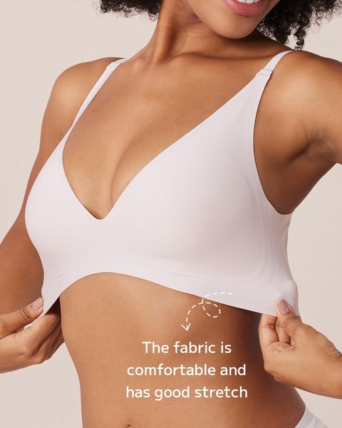

Promer helps you find the pattern, adapt it to your product, and create your own version in minutes.






