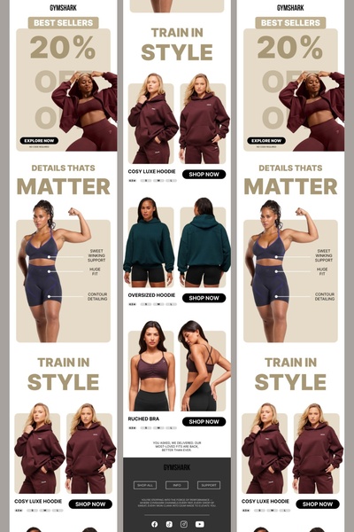
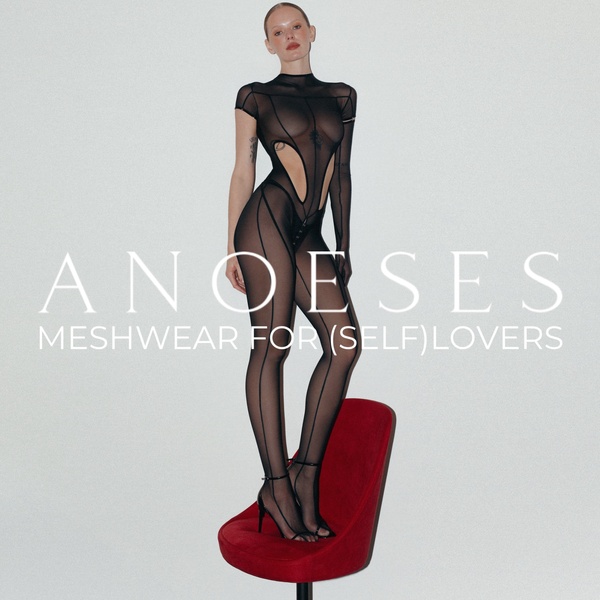
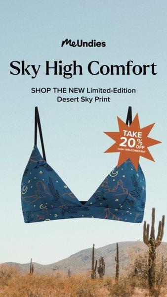
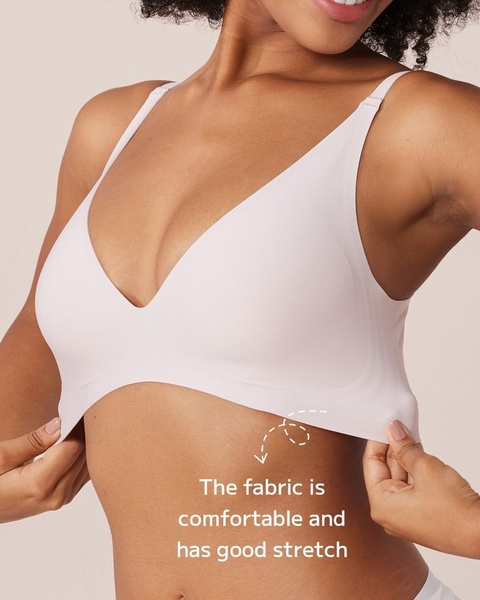
A vertical grid-style advertisement showcasing apparel best sellers with bold sale messaging and annotated product features.
Free credits included. No card required
This athleisure apparel ad creative leverages a clean, modular layout that separates the 20% off incentive from specific product highlight imagery. By grounding the visual narrative in recognizable, high-contrast lifestyle shots, the brand maintains focus on both the financial incentive and the technical details of the gear, ensuring users understand the value instantly. The consistent use of muted, sophisticated tones directs the eye toward the primary call to action, effectively balancing promotional urgency with premium product positioning.
This pattern functions because it respects the mobile user's limited attention span by pairing a bold top-level hook with a structured, scannable product grid. Most Promer AI users find that adopting this grid-based approach works well for categories where technical product features—like contouring or support—need visual validation alongside a price incentive. It is important to note that performance varies by audience and timing, but a modular layout typically outperforms cluttered, text-heavy designs in the apparel sector.
A high-converting ad starts with a clear hierarchy that separates your primary value proposition from the specific product details the customer needs to see.
Pro tip
When using a grid-style layout, ensure your text-to-image ratio remains balanced across all panels to keep the design feeling premium rather than promotional. Grouping technical benefits with specific product images helps reduce friction by answering potential customer questions before they even click the CTA.




.png)
.png)




.png)


Promer helps you find the pattern, adapt it to your product, and create your own version in minutes.






