
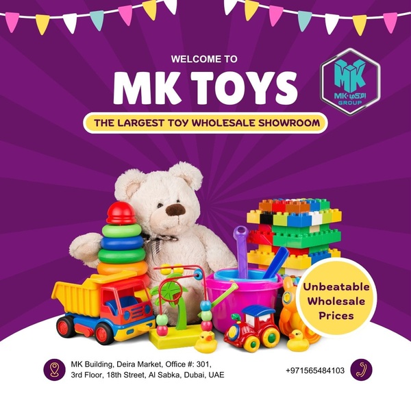
A vibrant 2:3 vertical graphic featuring a pile of colorful building blocks and a teddy bear, highlighting a 30% off discount offer.
Free credits included. No card required
This Kids Toy Sale ad creative excels by leveraging a clear, high-contrast visual hierarchy that directs the eye immediately to the discount offer. The ad succeeds by combining a bold, emotive color palette with a prominent '30% off' bubble, effectively anchoring the user's attention on the value proposition before they explore the product assortment.
By keeping the layout clean and focused, the brand creates an environment that feels both playful and urgent. This approach works for most ecommerce teams because it reduces cognitive load while highlighting the specific benefit of the sale; you can replicate this layout efficiency by using Promer AI to maintain high-converting structures across your own product catalog.
Great ads start from a clear offer structure that communicates value instantly to the shopper, regardless of the product category.
Pro tip
Vary your discount callouts to see if specific percentage-off amounts perform better than flat dollar-off discounts. Even in a toy-focused creative, the urgency of the 'special discount' remains a reliable hook for driving immediate clicks.









Promer helps you find the pattern, adapt it to your product, and create your own version in minutes.






