
A 1:1 ratio ad graphic utilizing a high-contrast red-on-yellow color scheme to highlight a 40% discount on dog toys.
Free credits included. No card required
This dog toy ad creative leverages a high-contrast, minimalist design to deliver a clear value proposition to pet owners immediately. By isolating the '40% off' offer within a bold circular focal point, the brand eliminates visual clutter to ensure the primary incentive is the first thing a user sees while scrolling.
This pattern works because it pairs recognizable product imagery with high-energy brand colors, creating an association between playfulness and value. When using Promer AI to analyze or replicate such structures, you can ensure your product remains the hero while maintaining the same conversion-optimized layout that typically drives higher click-through rates.
Great ads start from an idea, a feeling, or a structure, not a blank design.
Pro tip
When applying this layout to your own products, keep the product imagery consistent with your brand's existing visual identity to maintain trust. You can also experiment with different accent colors for the discount circle to see if a contrasting color boosts your CTR more effectively than the standard brand palette.




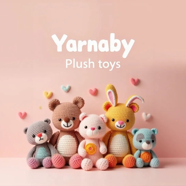

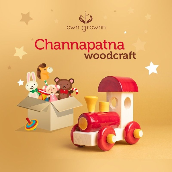



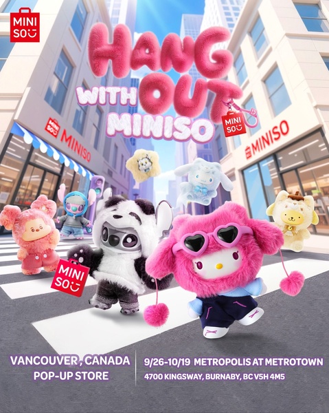

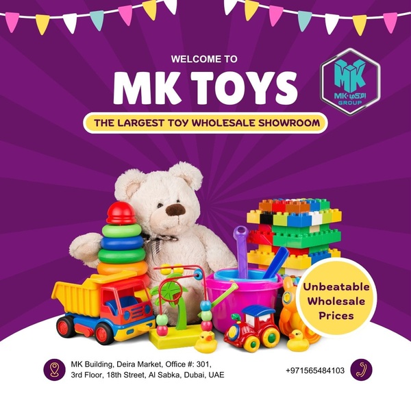



Promer helps you find the pattern, adapt it to your product, and create your own version in minutes.






