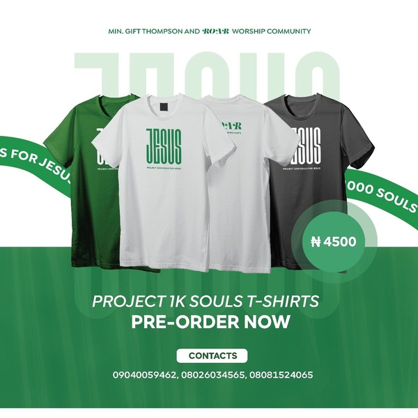
A clean, color-coordinated product display featuring multiple T-shirt variations to drive pre-orders for a specific campaign.
Free credits included. No card required
This T-shirt ad creative effectively utilizes a high-contrast, product-focused layout to deliver a direct offer to its target audience. By placing the merchandise front and center, the design allows the visual appeal of the apparel to carry the weight of the messaging while the clean typography ensures that the pre-order call-to-action remains the focal point for the viewer. The core strength of this strategy lies in its simplicity and clarity, which minimizes cognitive load during the scrolling experience.
For most performance teams, this pattern of using a unified color palette and an organized product grid works well to establish brand consistency and urgency for a new launch. You can leverage the Promer AI platform to analyze similar direct-response structures for your own product launches, ensuring that your layout choices align with current conversion benchmarks while maintaining a clean aesthetic.
Great ads start from a clear structure that puts the product in the best possible light while keeping the value proposition unmistakable.
Pro tip
When running a pre-order campaign like this, try adding a subtle countdown element or a scarcity trigger to the bottom of the creative to increase click-through rates. These small additions can significantly lift performance without cluttering the main visual display.
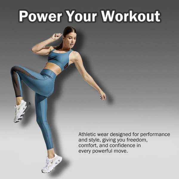
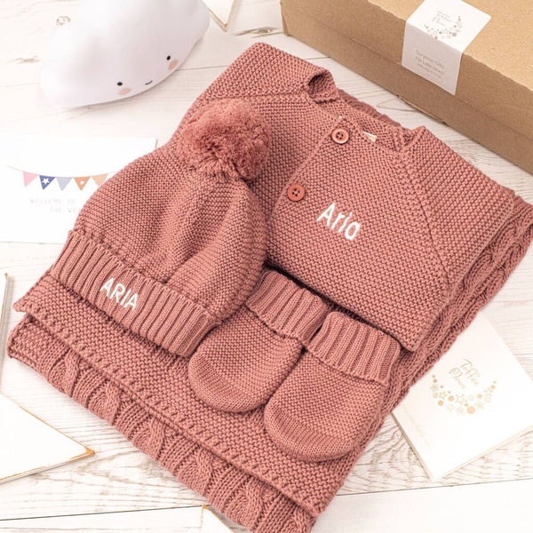
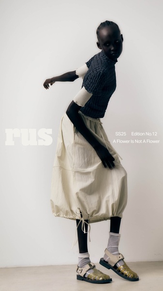









Promer helps you find the pattern, adapt it to your product, and create your own version in minutes.






