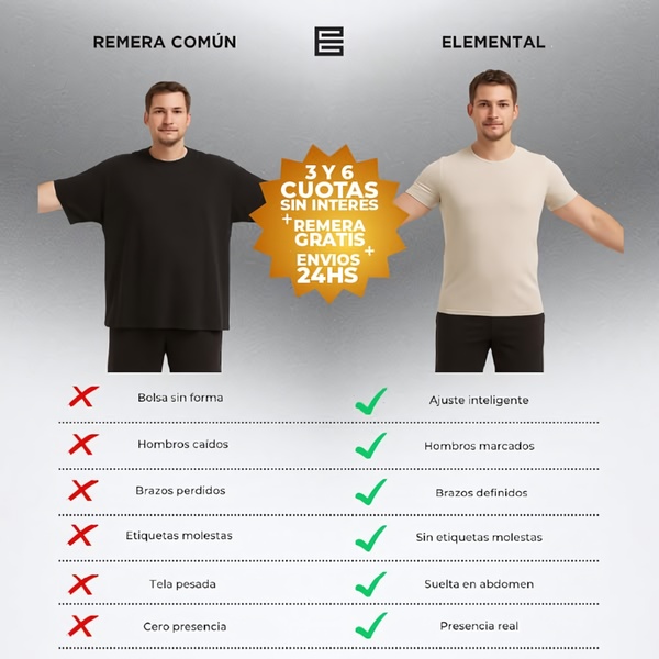
A square 1:1 side-by-side comparison image showing the difference in fit and presentation between a standard shirt and a premium elemental shirt.
Free credits included. No card required
This t-shirt ad creative utilizes a classic side-by-side comparison to instantly visualize product superiority for the viewer. By clearly contrasting a poorly fitted 'common' shirt against the structured 'elemental' version, the creative forces an immediate value assessment in the mind of the consumer.
This pattern works effectively for apparel because it turns abstract fit benefits into concrete, readable data points. Using Promer AI allows marketers to test these comparison structures rapidly across different product variants to see which specific feature callouts resonate most with their audience, typically leading to higher engagement in most cases.
Great ads start from a clear problem-solution tension that the customer recognizes instantly, not a complex design.
Pro tip
Instead of just listing generic features like 'fit', use the text space to address specific physical pain points your customers mention in reviews, such as 'bunching' or 'poor collar shape'. When you use a comparison hook, the more specific the labels are to the physical reality of the product, the higher your conversion potential will typically be.
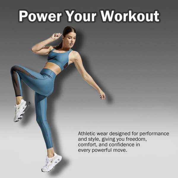
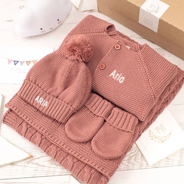


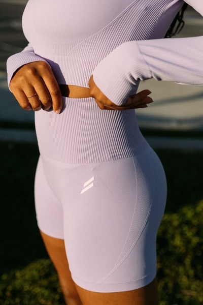









Promer helps you find the pattern, adapt it to your product, and create your own version in minutes.






