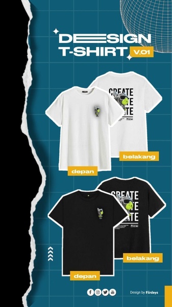
A vertical 9:16 layout showcasing front and back designs of white and black T-shirts using a structured grid and minimalist branding.
Free credits included. No card required
This T-shirt ad creative utilizes a structured grid layout to present multiple product variations simultaneously, which serves as a highly effective hook for apparel brands. By creating a clean visual hierarchy that separates the front and back views, the design instantly minimizes cognitive load while maximizing product clarity.
This approach works because viewers quickly identify the product details without feeling overwhelmed, a proven strategy for fashion-focused campaigns found within Promer AI. In most cases, simplifying your visual presentation allows the consumer to focus entirely on the design, making this a reliable template for consistent product launches.
A clean, grid-based presentation ensures that your product, not the design elements, does the talking.
Pro tip
For apparel ads, utilize negative space to draw the eye toward the product center. If you are showcasing multiple colorways, maintain a uniform background shadow to ensure the products appear as a cohesive set rather than disjointed images.
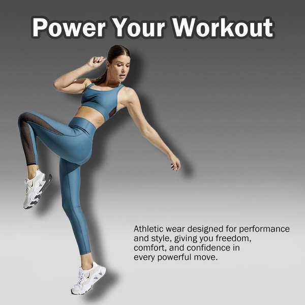
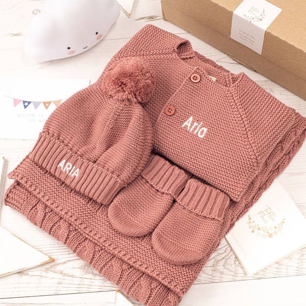
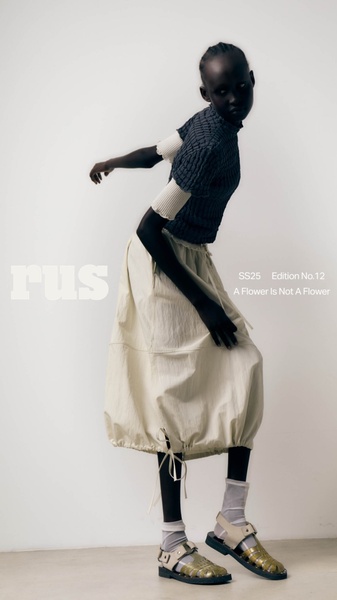











Promer helps you find the pattern, adapt it to your product, and create your own version in minutes.






