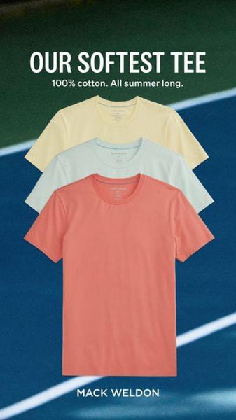
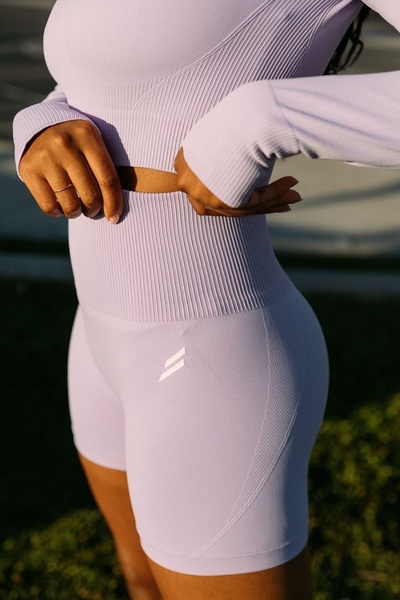
A vertical 9:16 ad featuring three folded T-shirts stacked neatly against a tennis court background, highlighting the product colors and material.
Free credits included. No card required
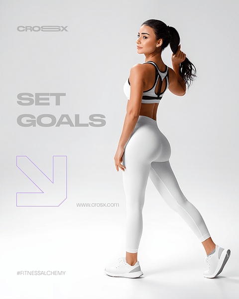
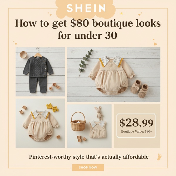
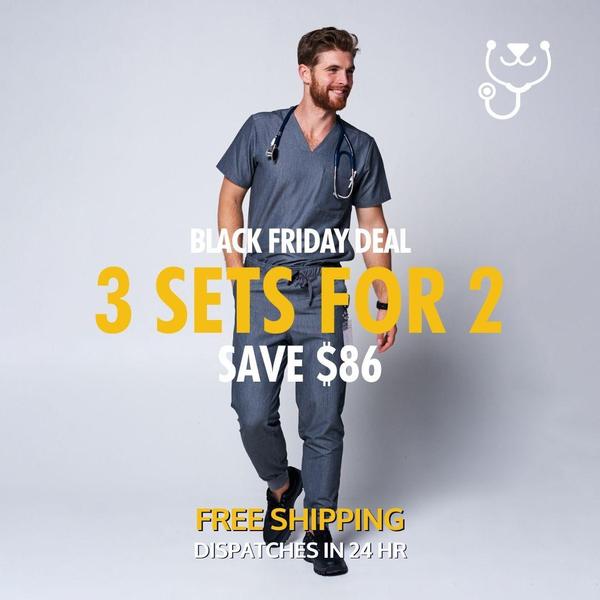
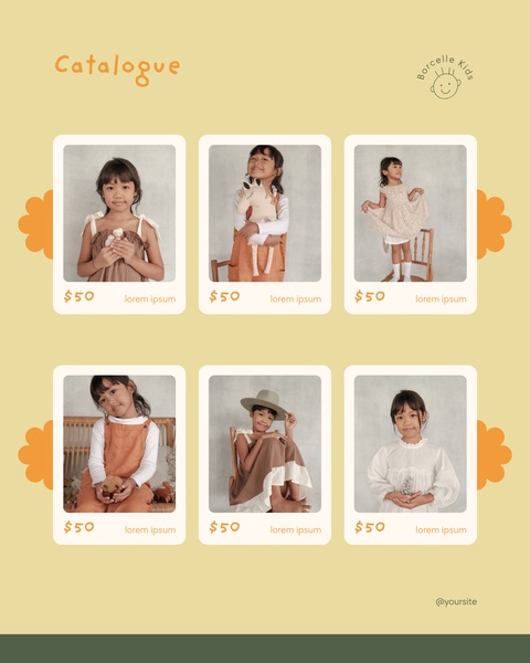
This T-shirt ad creative employs a clean, minimalist visual stack to emphasize the product's color range and texture immediately upon the scroll. By isolating the product against a simple, high-contrast background, the design forces the viewer's attention directly onto the fabric quality and the specific color palette being promoted for the season. The core of this strategy lies in using a clear, benefit-driven headline that pairs perfectly with the visual stack to instantly communicate comfort and readiness.
For most ecommerce teams, stripping away unnecessary visual clutter creates a focus that improves retention during the initial viewing period. This approach is highly effective for lifestyle products, as demonstrated by the Promer AI platform, which allows users to swap their own product imagery into high-performing layouts. Depending on your product category, aligning the background context with your specific customer’s lifestyle can further drive engagement with this simple, static structure.
A clean visual stack removes cognitive friction, allowing the product's quality to speak for itself without needing complex design layers.
Pro tip
To maximize this minimalist style, ensure your product photography uses consistent, high-quality lighting that highlights fabric texture. In most cases, the 'stacking' effect works best when the colors are complimentary or part of a cohesive seasonal collection rather than random inventory.
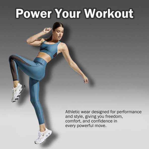
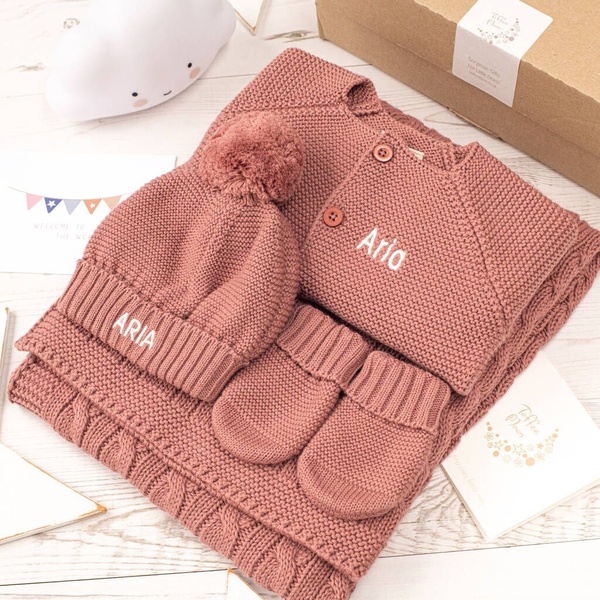
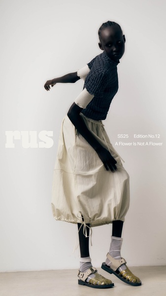





Promer helps you find the pattern, adapt it to your product, and create your own version in minutes.






