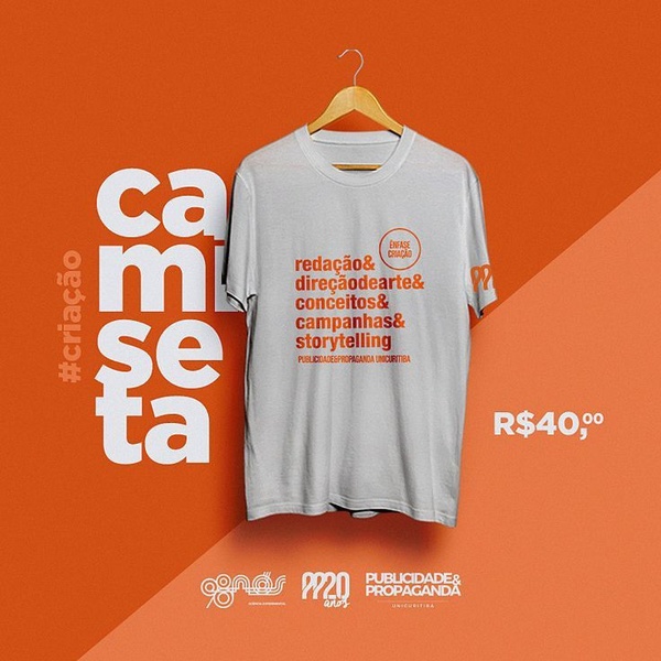
A clean, studio-lit T-Shirt ad featuring typography-focused design and direct price signaling on a bold orange background.
Free credits included. No card required
This T-Shirt ad creative succeeds because it prioritizes brand identity and clear messaging through a high-contrast, minimalist visual layout. By pairing a clean product image with bold, list-style typography that educates the viewer on the brand essence, the ad establishes immediate authority and product value without unnecessary clutter.
For most apparel brands, this strategy works because it eliminates distractions and focuses the user on the specific product and its selling price. Using Promer AI to standardize these layout principles allows teams to quickly swap product visuals while maintaining consistent brand typography, which typically improves CTR by ensuring the visual hierarchy remains optimized for mobile viewing.
Great ads start from an idea, a feeling, or a structure, not a blank design.
Pro tip
When using a bold, singular background color like this, ensure your product photography is captured in a neutral, flat-lay style to avoid clashing shadows. This keeps the focus on the silhouette and the typography, preventing the composition from feeling overcrowded.
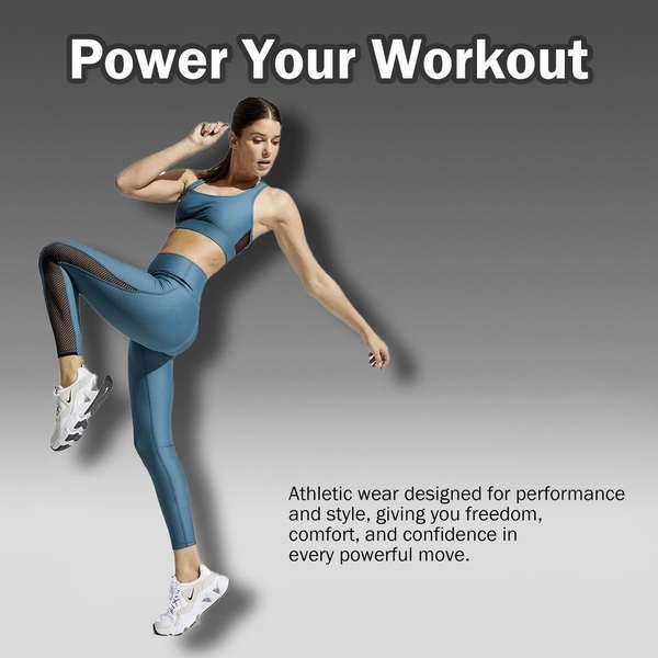
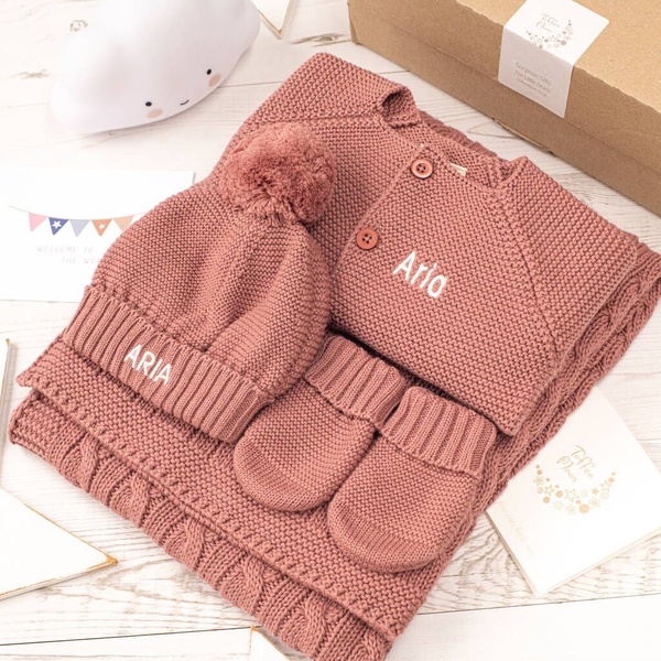
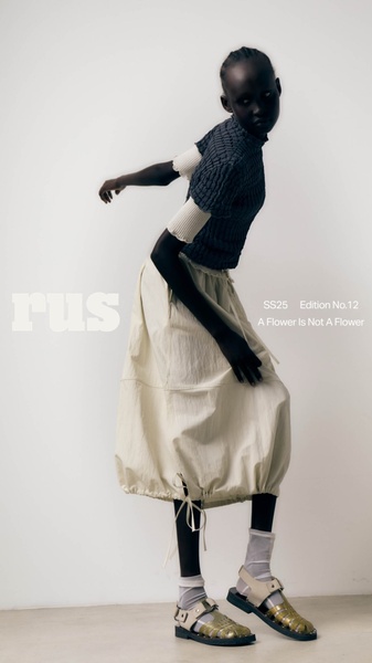


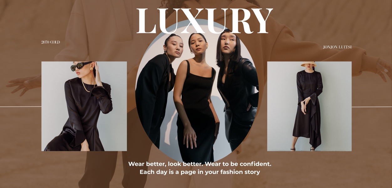


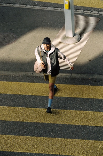
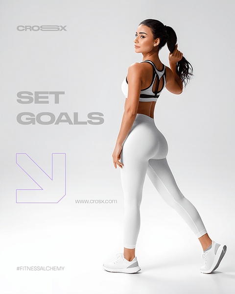



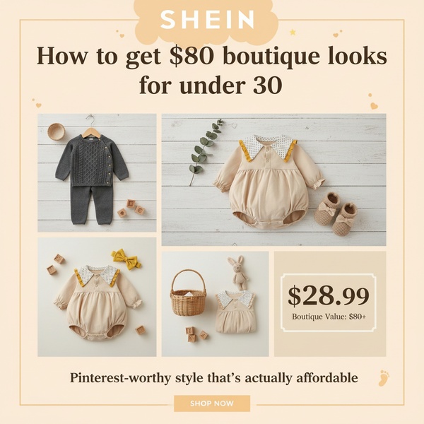

Promer helps you find the pattern, adapt it to your product, and create your own version in minutes.






