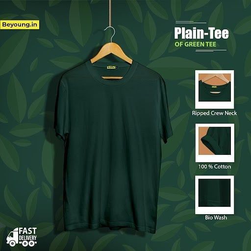
A clean, square-format ad showcasing a plain t-shirt with three specific feature highlights using a monochromatic design theme.
Free credits included. No card required
This plain t-shirt ad creative succeeds by stripping away excess noise to focus entirely on the garment's quality markers. The primary driver of performance here is the use of structured visual callouts to bridge the gap between a generic product and its tactile benefits. By anchoring the central image with specific details like fabric type and neck construction, the creative helps the viewer visualize the quality before they even click through to the landing page.
For most ecommerce teams, this pattern is effective because it reduces cognitive load, allowing the consumer to process product specifications at a glance. Utilizing Promer AI to replicate this structured approach can typically help brands maintain a clean aesthetic while communicating value. In most cases, relying on a consistent color palette tied to the product itself reinforces brand identity and perceived product premiumness.
A high-converting ad doesn't need to shout; it simply needs to clearly articulate the value of the product through organized visual evidence.
Pro tip
When using visual callouts, ensure the inset images are zoomed in enough to show genuine texture, such as the knit of the fabric or the stitching detail. This adds a sense of tangible quality that prevents the product from looking like a generic digital render. Test one variation with 'Benefit' text instead of 'Feature' text to see if your audience responds better to the 'why' than the 'what'.
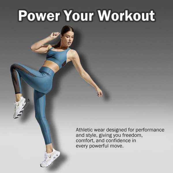
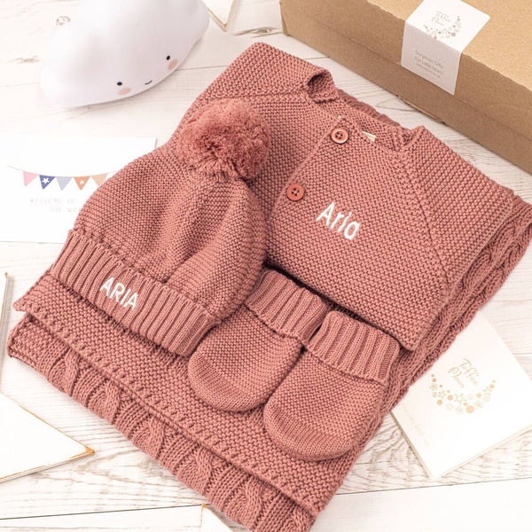


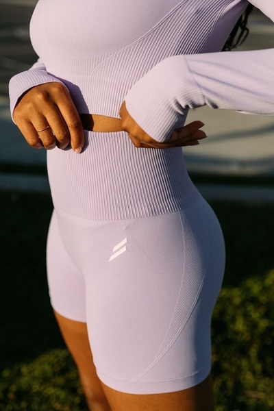










Promer helps you find the pattern, adapt it to your product, and create your own version in minutes.






