
A clean, high-contrast 1:1 sneaker advertisement featuring bold 'SALE' typography and a clear 50% off value proposition.
Free credits included. No card required
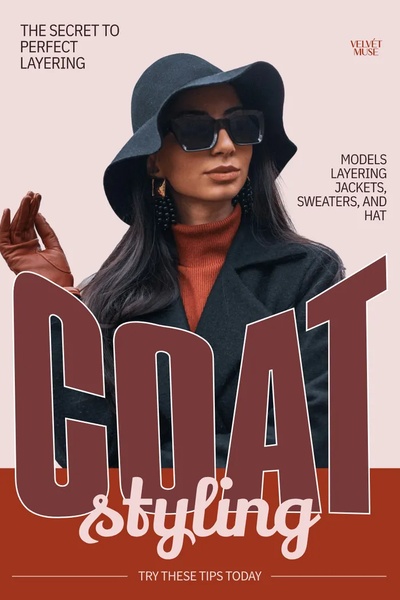
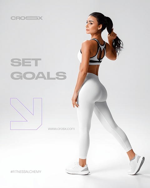
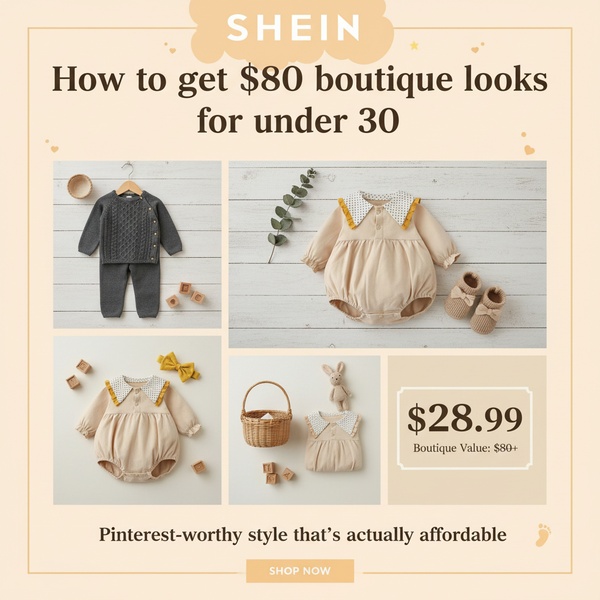
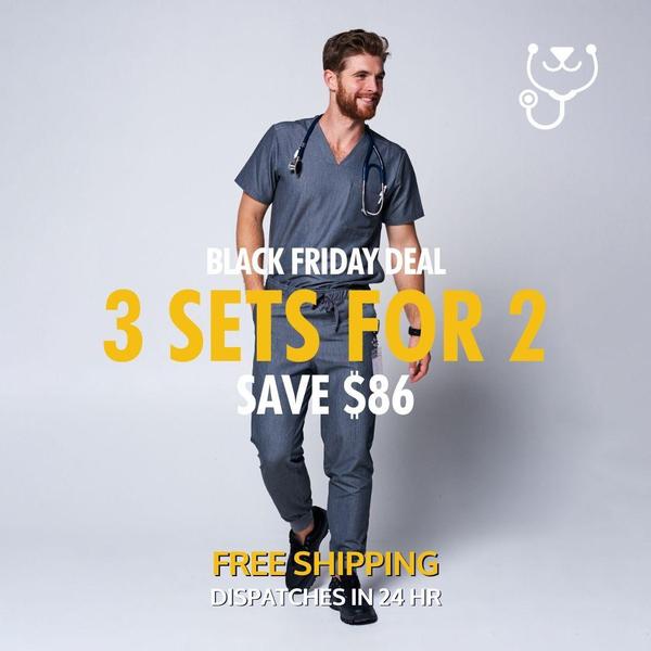
This sneaker ad creative employs a high-contrast, typography-led strategy that anchors the viewer's attention directly on the promotional offer. By utilizing a massive vertical 'SALE' graphic overlaying the subject, the ad establishes an immediate hierarchy of information that is difficult to ignore while scrolling. The color palette is intentionally limited to allow the product and the offer to share visual dominance without competing for attention.
Such patterns often perform well for retail brands because they minimize cognitive load, allowing the consumer to process the value proposition instantly. You can test similar layouts for your own inventory by using Promer AI to analyze the structural density of your existing assets, ensuring your product imagery is correctly positioned to support rather than obscure your key conversion messaging.
Effective ad design relies on the deliberate balance between structural clarity and the emotional weight of your primary product imagery.
Pro tip
When using bold, vertical typography, ensure that your model's pose maintains a directional line that leads the eye toward the CTA. Avoid placing text directly over the product to keep the silhouette recognizable at small, mobile-first resolutions.
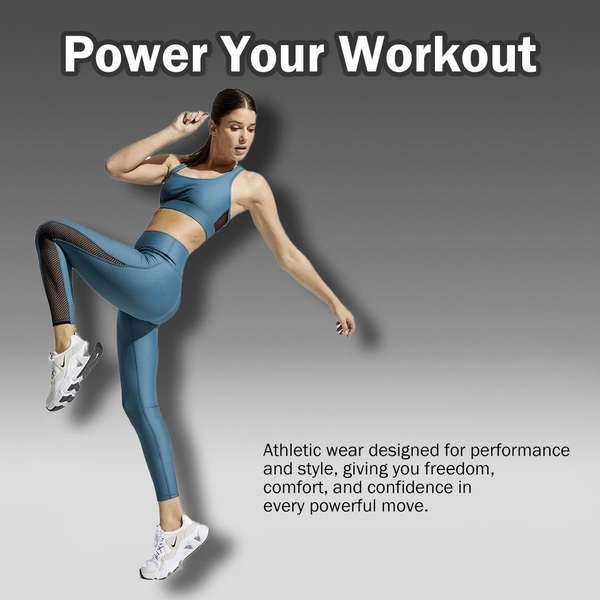
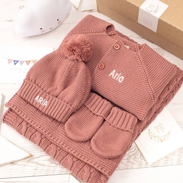
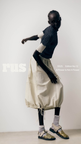




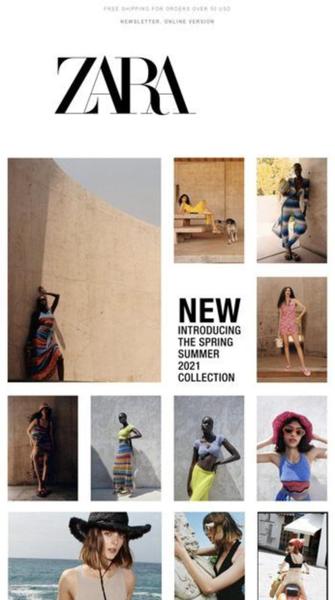







Promer helps you find the pattern, adapt it to your product, and create your own version in minutes.






