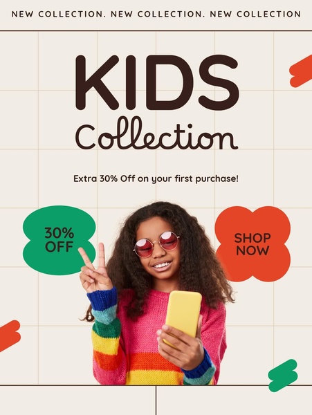
This ad features a vibrant kids sweater with a direct discount offer and clear, punchy call-to-action buttons designed for mobile screens.
Free credits included. No card required
This kids sweater ad creative utilizes a high-contrast, grid-based layout to isolate the product and offer. By combining a youthful, energetic subject with bold, saturated color accents, it creates a visually arresting hook that stops mobile scrollers in their tracks while immediately communicating the value proposition.
Great ads start from a clear, uncluttered structure that puts the product front and center while making the offer impossible to miss.
Pro tip
When using bold colors like in this example, ensure your primary CTA text maintains high legibility by using a contrasting dark font color. In most cases, simple, high-contrast buttons significantly outperform detailed or complex designs for initial user engagement.

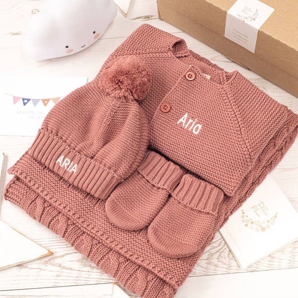

















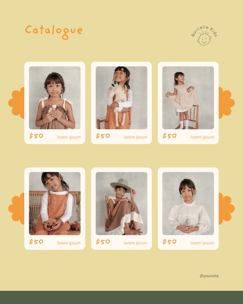
Promer helps you find the pattern, adapt it to your product, and create your own version in minutes.






