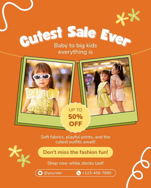
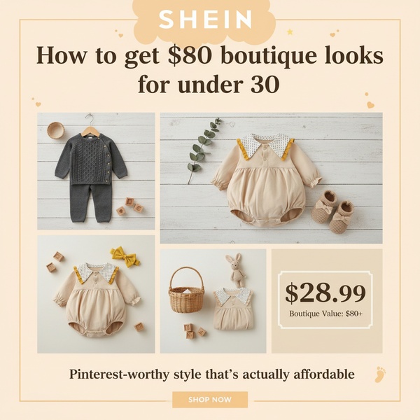
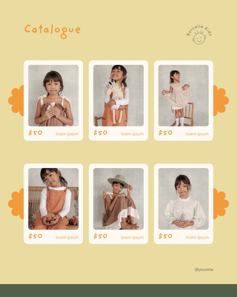
A 4:5 social ad featuring a split-photo grid layout of children in stylish outfits, highlighting a 50% off sale.
Free credits included. No card required
This kids clothing ad creative succeeds by combining a strong visual hook with a clear value proposition. By using a double-frame layout, the brand showcases multiple products at once, which increases the likelihood of a scroll-stopping moment for parents browsing their feeds. The use of high-contrast colors and a bold, centered offer badge creates immediate visual hierarchy that directs the user's attention from the images to the discount details.
For most ecommerce teams, this structure is repeatable across different seasons because it prioritizes lifestyle photography over generic product shots. You can achieve this same level of clarity by using Promer AI to maintain consistent brand colors and layouts even as you update your product photography to match your current inventory.
Great ads rely on a structured visual hierarchy that directs the eye immediately toward the primary value proposition.
Pro tip
When using a split-grid layout for kids clothing, ensure the subjects in your photos are expressing the same energy and style. Even if the products differ, matching the background tone or lighting between the two frames prevents the ad from feeling fragmented or distracting.








Promer helps you find the pattern, adapt it to your product, and create your own version in minutes.






