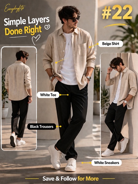
A high-conversion 3:4 layout showcasing a layered outfit with clear visual callouts for each garment.
Free credits included. No card required
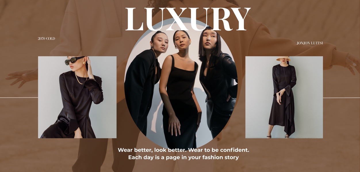
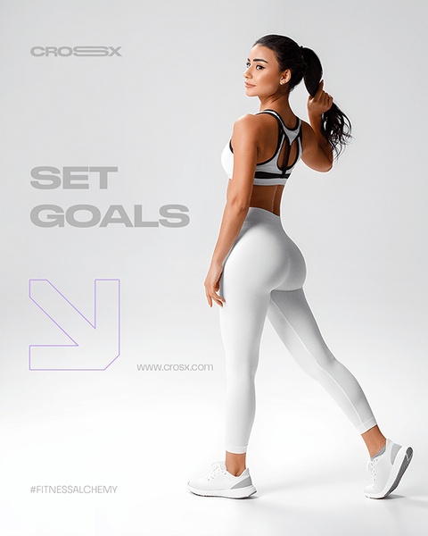
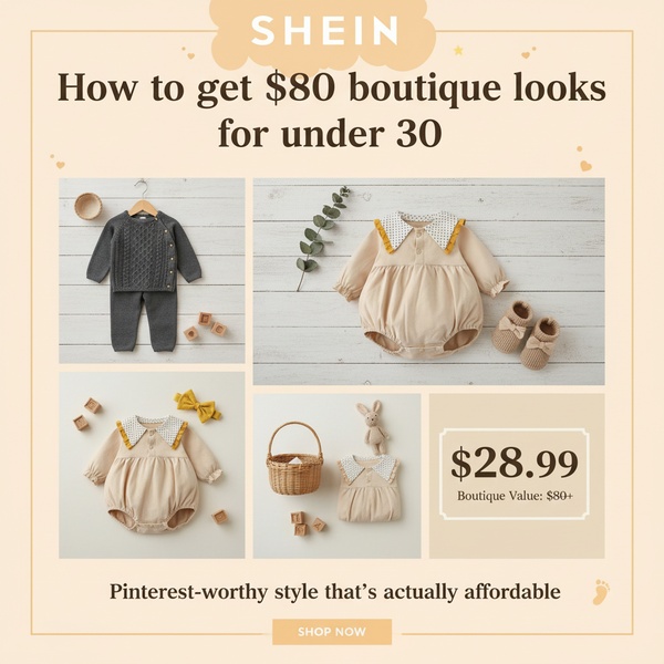
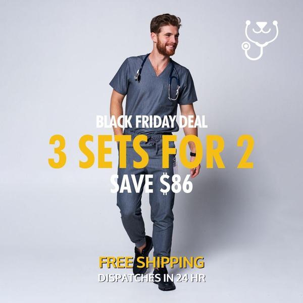
This Beige Shirt ad creative succeeds because it removes friction from the purchasing process through a structured educational framework. By utilizing a clean 3:4 aspect ratio, the ad places the product front and center while providing immediate, high-value styling cues that help the customer visualize the outfit in their daily life. The consistent use of white space and legible typography ensures that the aesthetic remains premium and uncluttered.
Following this structure with Promer AI allows performance teams to replicate the visual hierarchy that keeps viewer attention locked on the garment's composition. In most cases, ads that segment product details through clear callouts perform better because they satisfy both the emotional appeal of the look and the logical need to understand the product components. This approach reduces cognitive load, typically helping to improve click-through rates by establishing clear expectations before the user even clicks.
Great ads start from a structured framework that guides the viewer's eye exactly where you want them to look.
Pro tip
Use the educational listicle hook to show your product as part of a complete solution rather than just a standalone item. This strategy works well for apparel brands that want to emphasize styling versatility and increase average order value by selling the entire look.
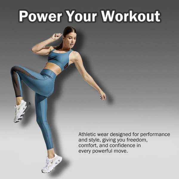
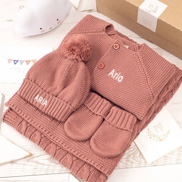





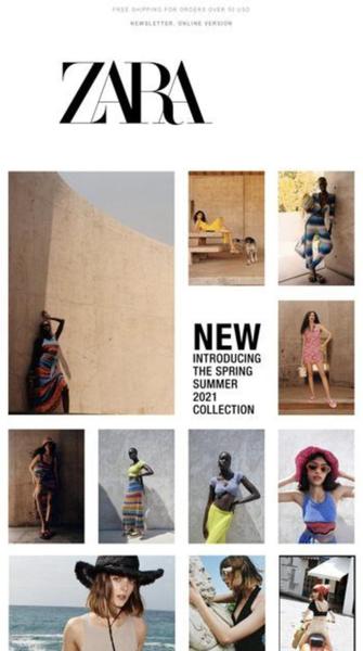







Promer helps you find the pattern, adapt it to your product, and create your own version in minutes.






