
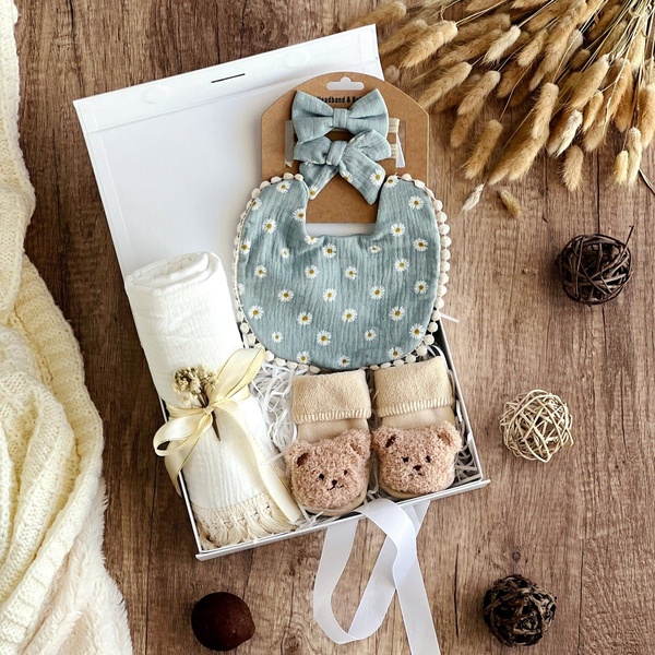
A 2:3 vertical ad layout showcasing multiple product categories with specific discount percentages and a central, engaging baby hero image.
Free credits included. No card required
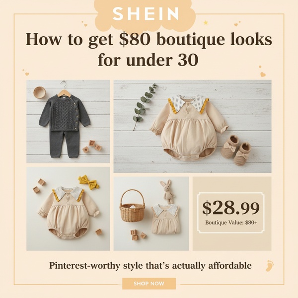
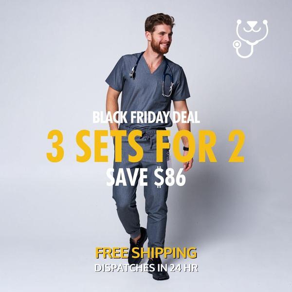
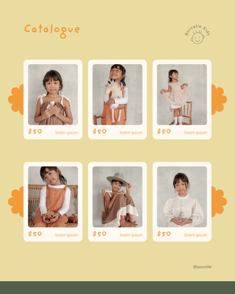
The baby product ad creative leverages a structured grid layout combined with a high-trust central hero image to immediately communicate sale depth across multiple categories. This visual hierarchy forces the viewer to process the total brand value proposition before individual product details. By combining essential baby items with clear, bold percentage-off badges, the ad minimizes friction for parents scanning for specific discounts.
This specific approach performs well for brands by balancing high-level aspirational imagery with actionable performance data that guides the user toward a purchase. For most ecommerce teams, using Promer AI to maintain this balance of clean product display and promotional clarity is vital when executing multi-product campaigns. Relying on this structured framing typically ensures that even complex discount architectures remain legible across mobile-first ad placements.
Effective multi-product sales are won when the visual structure works harder than the copy to guide the user's eye.
Pro tip
When running a broad offer, ensure the central hero image matches the 'vibe' of your best-selling product category to keep the visual promise consistent. If your core strength is baby care, keep the center image related to care items rather than toys to prevent customer confusion.









Promer helps you find the pattern, adapt it to your product, and create your own version in minutes.






