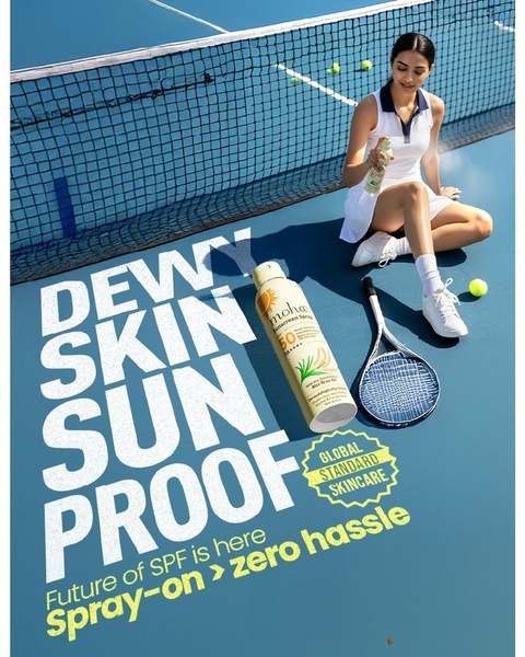
A high-angle, clean product shot of a sunscreen spray on a tennis court, combining lifestyle appeal with bold text-based benefit communication.
Free credits included. No card required
This sunscreen spray ad creative leverages a clean, high-contrast, top-down composition that frames the product directly within its intended usage environment. By placing the bottle on a tennis court alongside the athlete, the brand creates an instant association between the product and an active, outdoor lifestyle, while the bold, white, sans-serif typography ensures that the primary value proposition is impossible to miss. The clarity of the benefit-led headline, paired with a direct contextual environment, effectively reduces cognitive load, allowing the viewer to grasp the product's utility at a glance.
For most ecommerce teams, this structure is a highly repeatable pattern because it relies on the synthesis of situational relevance and bold text-based hierarchy to stop the scroll. By using Promer AI, you can systematically test this 'Lifestyle-Plus-Benefit' format for your own products, ensuring that your core messaging is paired with a visual setting that resonates with your specific target audience's daily habits.
Great ads start from a structure that aligns the product's primary utility with the environment where your ideal customer lives their life.
Pro tip
When adopting this format, match your background color saturation to your packaging to create a pleasing, high-contrast visual. A cluttered background can diminish the effect, so ensure the environment is either tightly composed or sufficiently blurred to maintain focus on the hero product.




















Promer helps you find the pattern, adapt it to your product, and create your own version in minutes.






