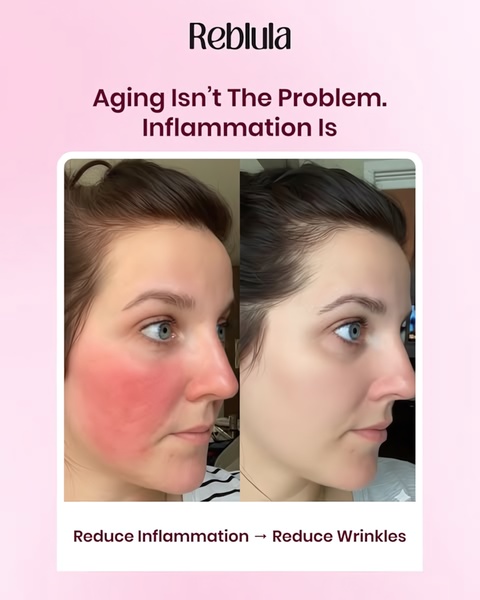
A high-contrast visual comparison of skin inflammation versus clear, calm skin, utilizing a simple text-based problem-and-solution headline structure.
Free credits included. No card required
This skincare serum ad creative uses a high-contrast visual hook to bridge the gap between user pain and product benefit. The effectiveness of this approach relies on a clear visual transformation that validates the brand's core claim of reducing inflammation as the root cause of aging. By stripping away complex jargon, the layout allows the user to instantly identify their own skin struggle, making the visual proof the primary driver for stopping the scroll.
For most ecommerce teams, this pattern works because it pivots from a generic anti-aging message to a specific medical-style problem identification. You can replicate this structural clarity with Promer AI by focusing on a singular, observable benefit that distinguishes your product from competitors. This type of direct storytelling typically performs well when the visual results are immediate and recognizable, reducing friction for the potential customer.
The strongest ads don't just sell an outcome; they reframe the user's understanding of their own problem through undeniable visual proof.
Pro tip
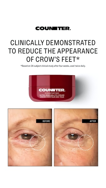
Do not just use any before-and-after photo; ensure the lighting and angle in both images are identical to maintain clinical credibility. If the lighting is inconsistent, it creates a lack of trust that can significantly lower your conversion rate regardless of your ad copy.
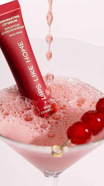
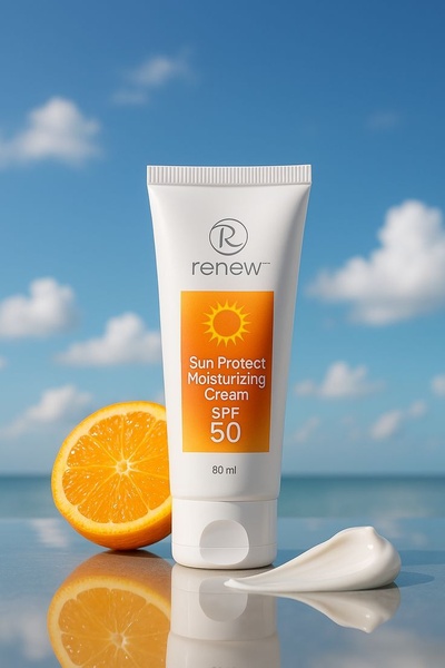
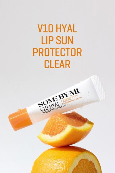

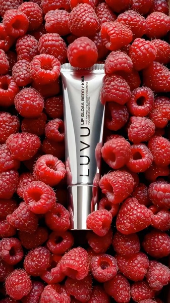
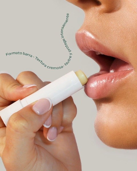
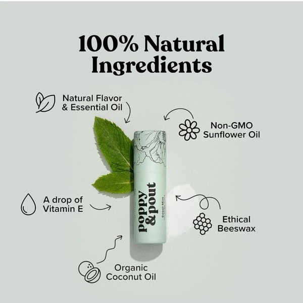
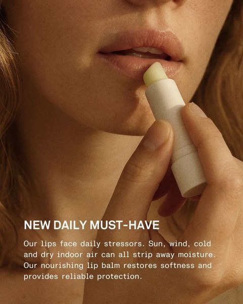
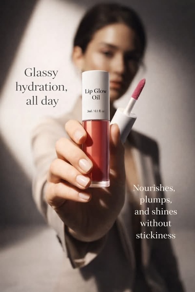
Promer helps you find the pattern, adapt it to your product, and create your own version in minutes.






