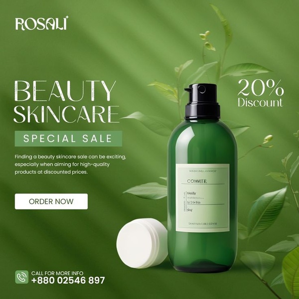
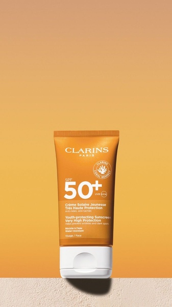
A clean, green-themed promotional ad featuring a skincare bottle and a direct 20% discount offer.
Free credits included. No card required
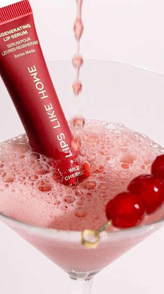
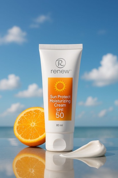
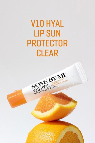
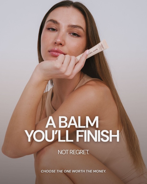
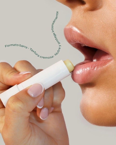
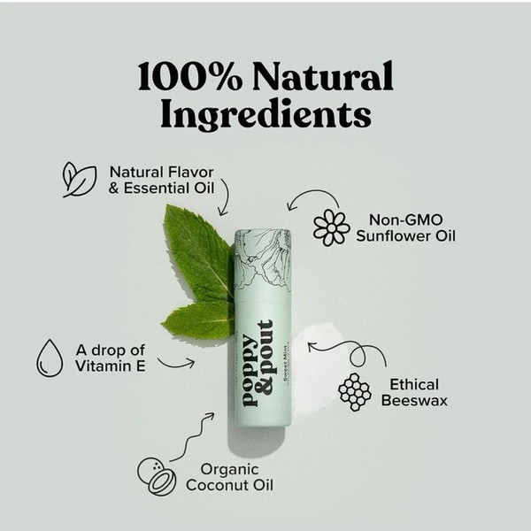
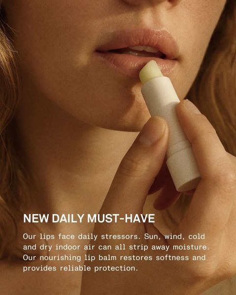
This skincare bottle ad creative excels by utilizing a minimalist visual hierarchy that immediately draws attention to the product and the offer. The focused, green-toned environment creates a sense of natural efficacy, while the 20% discount acts as a clear, high-intent hook to drive conversions. By stripping away visual clutter, the design forces the viewer to process the product and the sale simultaneously, which is essential for mobile-first scrolling environments. Using Promer AI to analyze this structural clarity can help you replicate the same impact for your specific product lineup. This approach works well for skincare brands because it mimics high-end editorial photography while keeping the transactional call-to-action front and center, ensuring the value proposition is never lost.
Great ads start from an idea, a feeling, or a structure, not a blank design.
Pro tip
When using this clean, single-product layout, test variations of the background texture. While a solid green works well here, introducing subtle bokeh or light leaks can sometimes increase click-through rates by making the image feel more dynamic without losing its minimalist core.
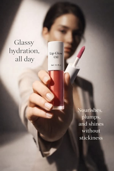
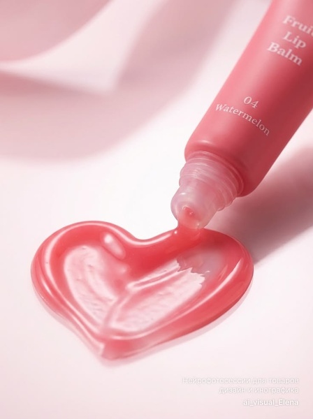
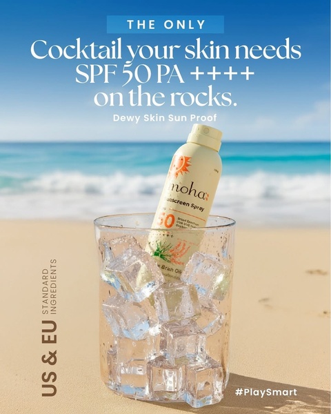
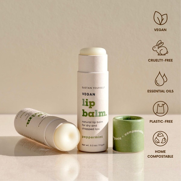
Promer helps you find the pattern, adapt it to your product, and create your own version in minutes.






