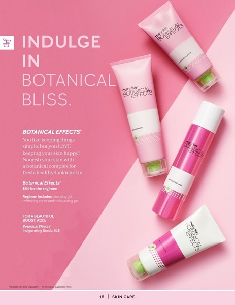
A clean, minimalist flat-lay advertisement featuring a four-piece skin care regimen set on a dual-toned pink background.
Free credits included. No card required
The skin care set ad creative leverages a high-key, minimalist flat-lay strategy to communicate simplicity and botanical purity to the target audience. By utilizing a split-tone pink background and diagonal product placement, the layout directs the eye through the regimen from the headline to the product benefits, creating a cohesive visual narrative that feels premium yet accessible.
This structural choice works because it minimizes cognitive load while focusing on the brand's core value proposition through clear, hierarchy-based typography. For most ecommerce teams, Promer AI provides a way to standardize this level of visual organization across different product lines, ensuring that your own product imagery maintains a consistent aesthetic that drives click-through rates.
Great ads start from a clear structure that allows the product's identity to speak for itself without unnecessary visual clutter.
Pro tip
When using a split-color background, ensure your product packaging has enough contrast against both shades to avoid losing detail. A subtle drop shadow under each product, as seen in this example, can help bridge the gap between colors and make the items appear grounded rather than floating.


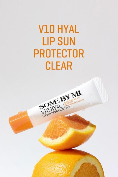

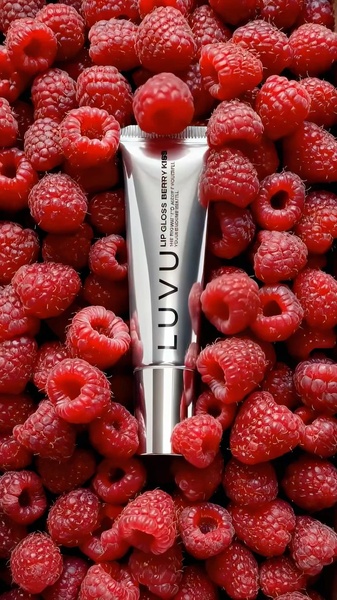
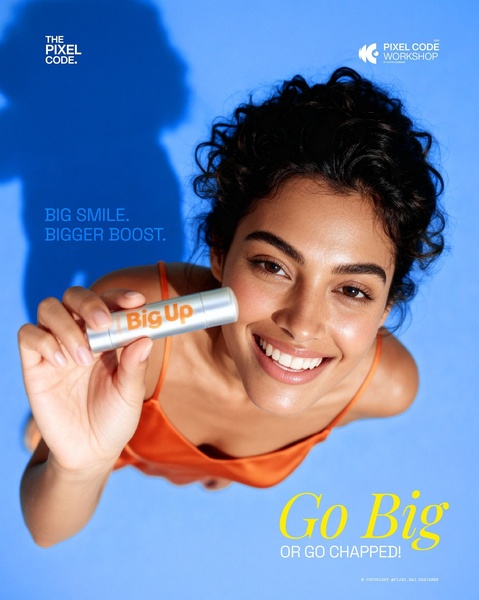

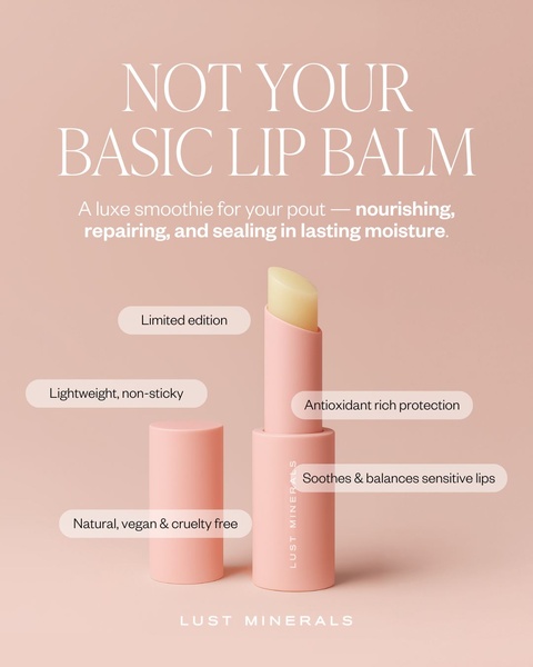





Promer helps you find the pattern, adapt it to your product, and create your own version in minutes.






