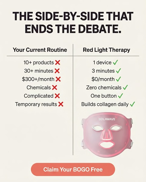
A split-screen comparison graphic that contrasts the inefficiency of standard routines with the streamlined benefits of a red light therapy device.
Free credits included. No card required
The red light therapy ad creative uses a logical 'Us vs. Them' framework to immediately expose the pain points of the customer's current routine. By positioning the product as the obvious, superior solution through a simple, high-contrast visual table, the brand effectively bypasses cognitive fatigue and forces the viewer to acknowledge the efficiency of the new device. This comparative structure works because it quantifies value in seconds, making the decision to switch feel like an objective choice rather than a risky purchase.
For most ecommerce teams, leveraging clear, data-backed comparisons can simplify complex benefits for a high-tech product. Using Promer AI allows you to recreate this winning structure for your own product catalog, ensuring your ad creative maintains a high density of information without feeling cluttered or overwhelming to the consumer.
A powerful ad doesn't just sell a product; it reframes the viewer's entire understanding of their daily routine.
Pro tip
When building comparison tables, ensure that your 'current routine' side reflects common, relatable frustrations rather than straw-man arguments. This maintains credibility while the green-check side reinforces why your product is the definitive, logical upgrade for the consumer.










Promer helps you find the pattern, adapt it to your product, and create your own version in minutes.






