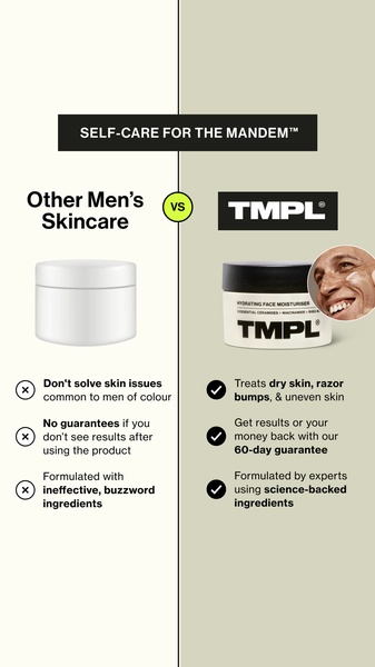
A vertical 9:16 comparison graphic showing the functional differences between generic skincare and the advertised Hydrating Face Moisturiser.
Free credits included. No card required
This Hydrating Face Moisturiser ad creative utilizes a classic comparison framework to immediately clarify the brand's unique value proposition. By using a split-screen design, it forces the viewer to process a direct side-by-side evaluation of product efficacy versus generic alternatives, which effectively grounds the brand's scientific claims in objective terms.
This pattern works for most ecommerce teams because it reduces the cognitive load on the prospect by summarizing complex benefits into digestible, check-marked points. You can build your own version of this comparative strategy using Promer AI to structure your product highlights and pain point alignment without needing to hire a designer for every iteration.
A powerful ad creative does not need to be busy; it needs to be an efficient delivery system for why your product is the obvious choice.
Pro tip
When building comparison charts, ensure the points you select address the most common, unaddressed friction points of your target audience. Do not just list generic features; contrast the specific 'pain' of standard solutions with the 'gain' of your product to drive home the value proposition.

Promer helps you find the pattern, adapt it to your product, and create your own version in minutes.






