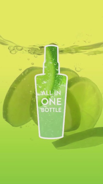
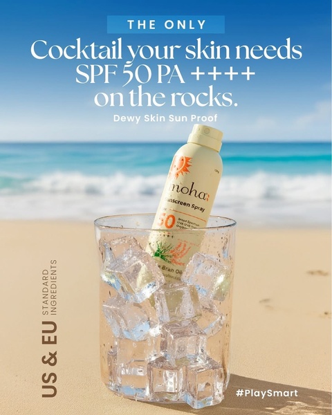
A minimalist product-centric graphic featuring a facial spray bottle submerged in a lime-infused water setting, highlighting a clean and refreshing brand identity.
Free credits included. No card required
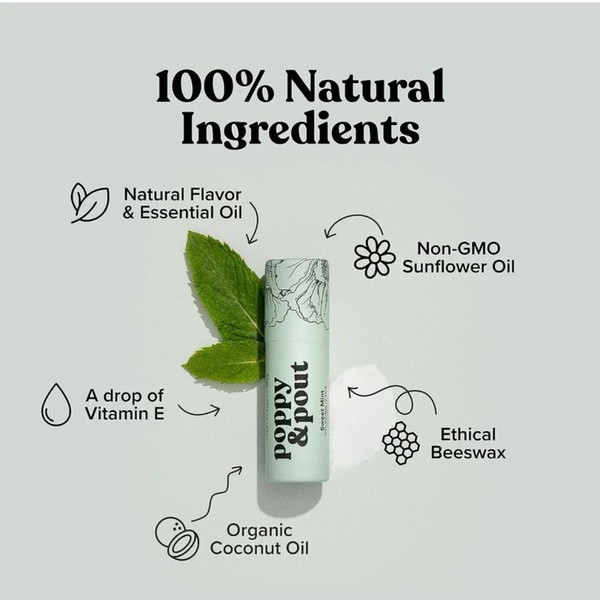
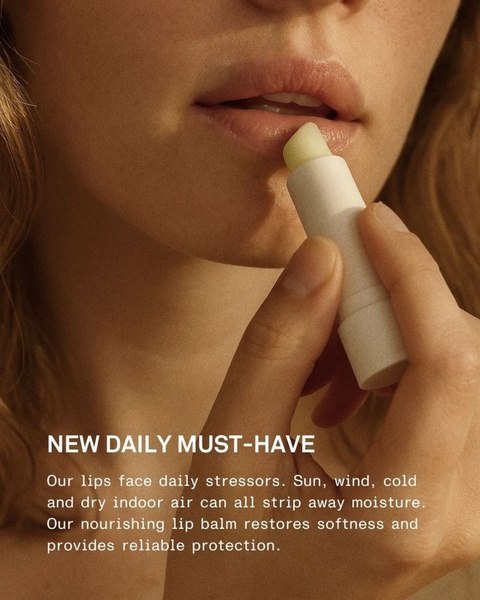
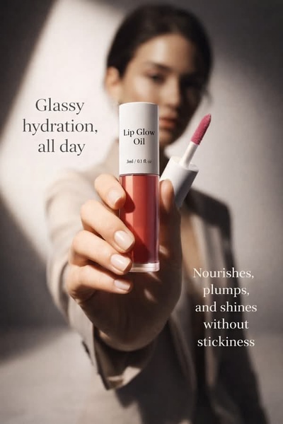
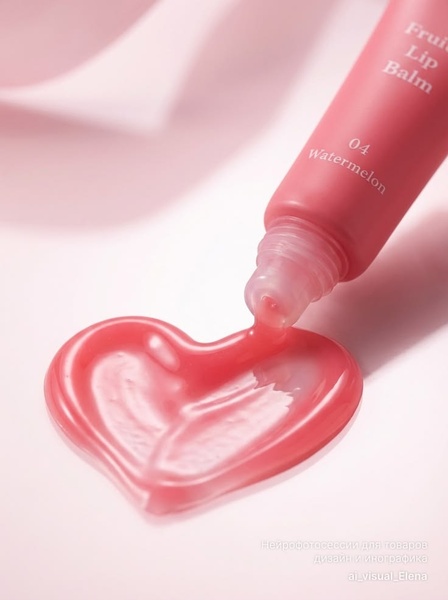
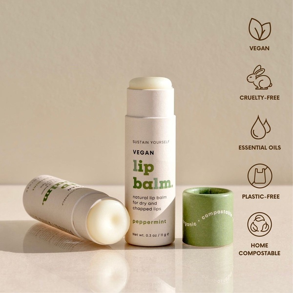
This facial spray ad creative succeeds by stripping away visual clutter to focus entirely on the product and its primary benefit. By using a bold, monochromatic color scheme and clear, centered typography, the ad creates a high-contrast visual anchor that stops the scroll on mobile feeds. The imagery communicates the refreshing nature of the formula before the user even reads the text, leveraging sensory association to build immediate brand trust.
For most ecommerce teams, this approach works because it mimics editorial design rather than traditional sales-heavy layouts. You can adopt this aesthetic using Promer AI to maintain high-quality product visuals while experimenting with different ingredient-based backgrounds. This strategy is effective when your product serves a specific, clean-label niche, as it positions your item as both a high-end choice and a functional solution.
A single compelling image that links your product to its core benefit is more effective than a cluttered collage of features.
Pro tip
When using minimalist layouts, ensure your font weight is heavy enough to remain legible against light or water-based backgrounds. Test this by viewing your creative at 50% scale to confirm the primary message still stands out as the focal point.
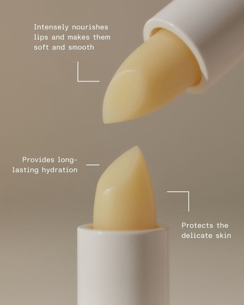
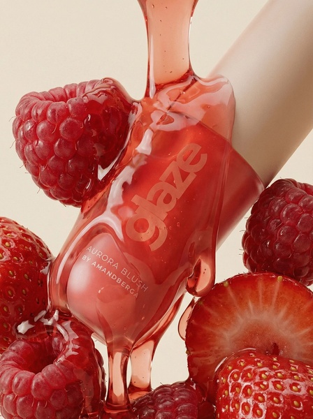
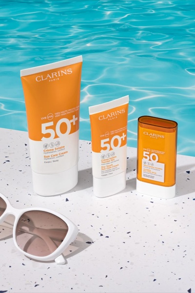


Promer helps you find the pattern, adapt it to your product, and create your own version in minutes.






