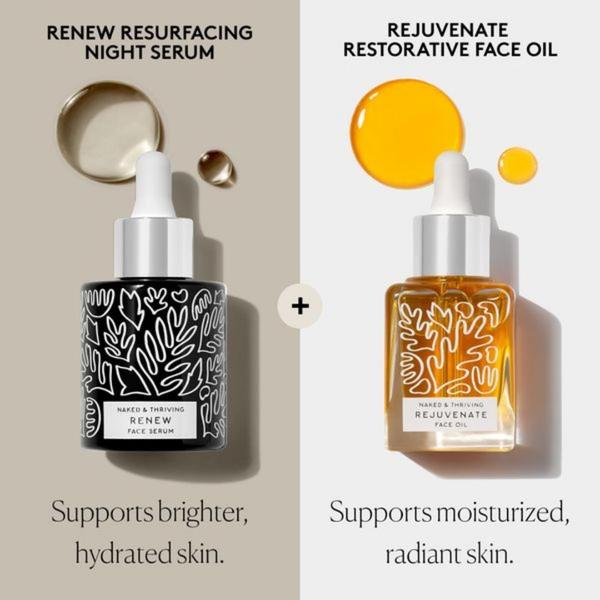
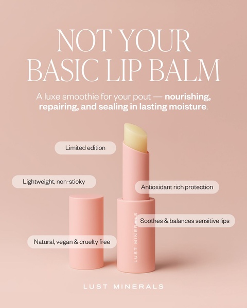
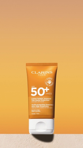
A split-screen composition showcasing two distinct skincare products with corresponding benefits, focusing on product clarity and ingredient benefits.
Free credits included. No card required
This face serum ad creative utilizes a clean, split-screen layout to simplify complex skincare routines for the consumer. By pairing the two products visually and anchoring each with a single, clear benefit statement, the brand removes the cognitive load that often prevents users from purchasing multiple items in a regimen. This structured approach provides immediate clarity on product utility while maintaining a sophisticated brand aesthetic.
For most ecommerce brands in the skincare space, this pattern works because it effectively segments product benefits without overwhelming the viewer. You can replicate this dual-layout strategy efficiently using Promer AI to ensure your product hierarchy and brand colors remain consistent across different variations. Always focus on linking a specific product to a single primary skin outcome to maximize the impact of your messaging.
Great ads start from a logical pairing of product benefits rather than just a design trend.
Pro tip
To boost the effectiveness of a comparison ad, ensure that the background colors used for each side create a distinct but harmonious contrast. This helps the brain instantly categorize the two items as unique steps in a singular, cohesive routine rather than two unrelated choices.




Promer helps you find the pattern, adapt it to your product, and create your own version in minutes.






