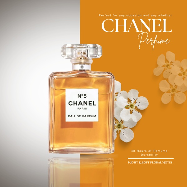
A high-end perfume bottle centered between a neutral grey background and a warm, floral-accented orange field, emphasizing product elegance.
Free credits included. No card required
The use of a split-tone background creates an immediate sense of visual order, positioning the perfume as a high-value item through deliberate negative space and color contrast. This structural choice frames the product as the central authority in the scene, effectively separating the bottle from the softer, abstract floral elements to reduce visual clutter.
This pattern works because it directs the viewer's gaze toward the product details while maintaining a premium brand aesthetic through color theory, a process made accessible via Promer AI. In most cases, utilizing clear separation between product photography and lifestyle accents improves readability for mobile users scanning feeds quickly.
A high-converting ad hinges on the harmony between your product and the negative space that allows it to stand out.
Pro tip
When using a split-screen layout for your perfume, align your text to the empty side of the frame rather than overlaying it on the bottle. This maintains the premium feel and keeps the product image clean, allowing the customer to focus on the bottle design.




















Promer helps you find the pattern, adapt it to your product, and create your own version in minutes.






