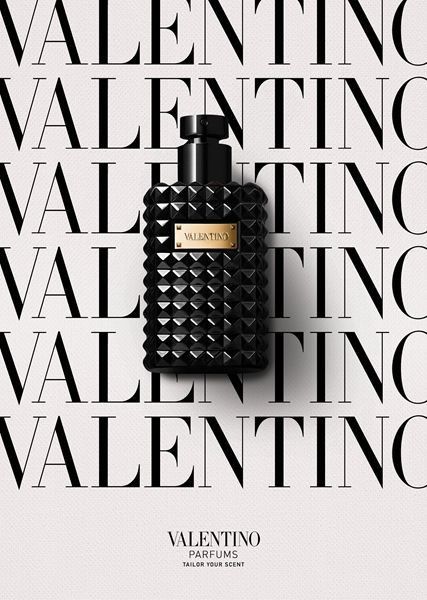
This creative showcases a premium perfume bottle centered against a high-contrast background of repeating brand text, emphasizing prestige and visual symmetry.
Free credits included. No card required
This perfume creative uses a high-contrast repeating pattern to create a powerful sense of authority and brand dominance. By anchoring the product in a perfectly symmetrical layout, the design demands attention through its clean, sophisticated repetition. This visual strategy works by removing all environmental noise and focusing entirely on the premium packaging details.
Luxury advertising is often defined by what you leave out rather than what you add in.
Pro tip
When using repeating patterns, ensure your font choice matches the sophistication of your perfume bottle hardware. Use an elegant serif typeface to mirror the high-fashion cues of the packaging and maintain visual consistency across your ad set.




















Promer helps you find the pattern, adapt it to your product, and create your own version in minutes.






