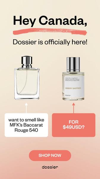
A minimalist, side-by-side product comparison creative used to announce brand availability in a new market while highlighting price value.
Free credits included. No card required
This perfume ad creative leverages a clean, high-contrast side-by-side layout that instantly anchors the viewer's focus on the value proposition. By placing the established premium benchmark next to the new alternative, the brand establishes immediate relevance within the category while using the headline to create a sense of regional exclusivity. The effectiveness of this approach lies in its ability to strip away visual clutter, forcing an immediate mental connection between the expensive incumbent and the brand’s price-accessible solution.
For performance marketers, this structure is a reliable way to communicate a 'Us and Them' positioning without resorting to heavy copy. Using Promer AI allows teams to replicate this minimalist aesthetic for their own inventory, ensuring the focus remains squarely on product photography and the price-to-quality gap. This strategy is typically most effective when the brand has a clear, recognizable competitor in the market and a strong, punchy value hook to finalize the conversion loop.
A winning ad is built on a clear, repeatable structure that puts the product’s core value proposition front and center for the viewer.
Pro tip
When running comparison-based ads, ensure the visual weight of your product is equal to the benchmark item to avoid subconsciously signaling a lower-tier product. Test the same copy with different background gradients to see which color palette improves the click-through rate for your specific demographic.




















Promer helps you find the pattern, adapt it to your product, and create your own version in minutes.






