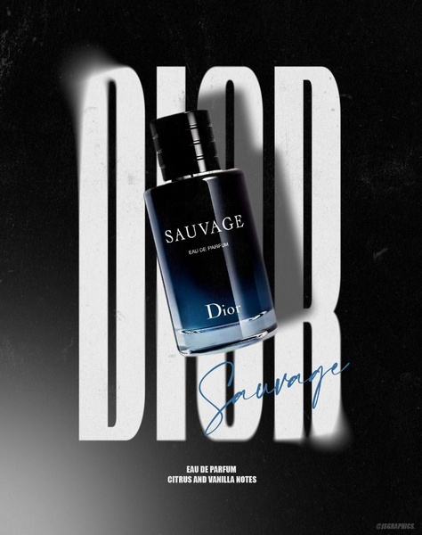
A high-contrast vertical ad displaying the cologne bottle centered over massive white typography with a moody black background.
Free credits included. No card required
The use of large, bold typography layered behind the cologne bottle creates an immediate sense of scale and authority. By keeping the background dark and high-contrast, the creative forces the eye directly toward the product, turning the brand name into a structural element that elevates the perceived value of the product.
This approach works because it minimizes visual clutter while maximizing brand recognition. For most teams, leveraging a clean, typography-driven layout ensures the product remains the undisputed focal point, a pattern you can easily replicate with Promer AI to maintain premium aesthetics across your ad sets.
Great ads start from an idea, a feeling, or a structure, not a blank design.
Pro tip
When using large typography in your creative, ensure the font choice aligns with the tone of your product. A serif font implies luxury and tradition, while a bold sans-serif suggests modernity and intensity.




















Promer helps you find the pattern, adapt it to your product, and create your own version in minutes.






