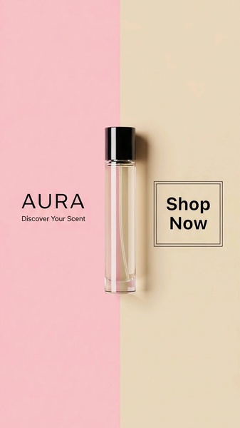
A 9:16 vertical split-screen design featuring a centered perfume bottle, balanced with pastel color blocks and clean typography to highlight product elegance.
Free credits included. No card required
The effectiveness of this perfume bottle ad creative relies on a symmetrical split-screen layout that draws the eye directly to the center product. By utilizing a high-contrast minimalist background and clear, uncluttered text, the ad removes all visual friction to focus exclusively on the brand's aesthetic appeal.
This structural simplicity is a reliable pattern for Promer AI users looking to highlight premium beauty products. In most cases, color-blocking allows you to pair your product's primary shade with a neutral tone, creating a professional studio feel without requiring an expensive production team.
Great ads start from a balanced visual structure that allows the product's identity to breathe, not from over-crowded design.
Pro tip
To increase the perceived value of your perfume, try slightly adjusting the saturation of the two color blocks to match the specific notes of your scent—softer, lighter colors for floral, and richer tones for woodier, deeper scents. This subtle color storytelling keeps the creative feeling fresh during long-running campaigns.




















Promer helps you find the pattern, adapt it to your product, and create your own version in minutes.






