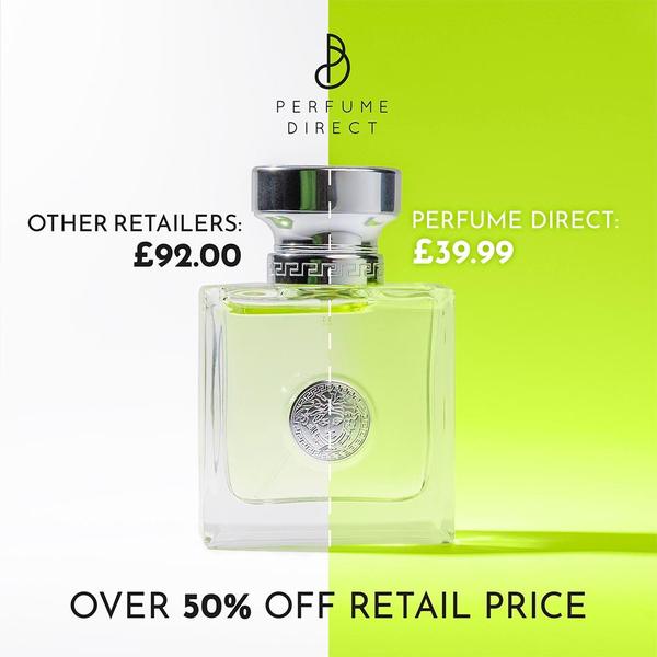
A split-screen creative comparing high retail perfume prices against a discounted store price, highlighting value through a clear visual contrast.
Free credits included. No card required
This perfume bottle ad creative leverages a stark, dual-tone split screen to highlight a massive price disparity. By placing a high market rate against a significantly lower offer, the creative uses a 'Us vs. Them' framing to immediately establish superior value without requiring long-form copy.
Such high-contrast designs work well because they remove friction in the purchase decision, allowing users to instantly recognize savings. You can achieve this same structural clarity by using Promer AI to analyze your own high-value product images, typically resulting in cleaner, more performant ad variations for established retail brands.
A powerful ad strategy doesn't need to be complex; sometimes the most effective hook is simply showing the math.
Pro tip
When using a split-screen price comparison, ensure the visual difference between the two sides is extreme enough to be readable at a glance on small mobile screens. Experiment with slightly different color pairings to see if a more muted or vibrant tone better matches your brand identity while maintaining that essential 'Us vs. Them' tension.




















Promer helps you find the pattern, adapt it to your product, and create your own version in minutes.






