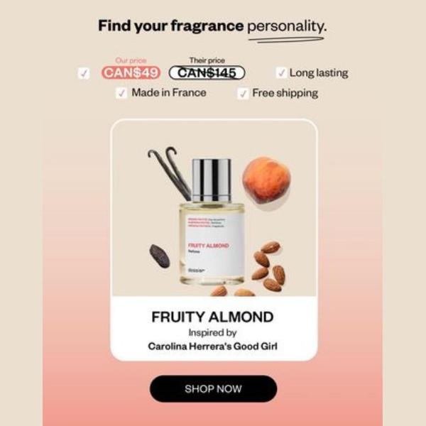
A square-format ad creative featuring a perfume bottle flanked by ingredient icons, highlighting price, origin, and product value propositions.
Free credits included. No card required
This perfume ad creative succeeds by leveraging a clear Us vs. Them price comparison to immediately establish value for the consumer. By placing a stark contrast between a lower 'our price' and a significantly higher 'their price', the visual hierarchy anchors the viewer on the savings before they even consider the scent profile. The clean, minimalist flat-lay aesthetic ensures the product remains the hero while the checklist of features reinforces quality and accessibility.
For most ecommerce brands selling fragrance, transparency regarding price and origin helps overcome the primary purchase barrier of perceived low quality in affordable alternatives. Using Promer AI allows you to deconstruct this layout and apply it to your own product line, swapping the core visual elements while maintaining the high-converting value-prop structure that typically resonates in competitive beauty categories.
Great ads start from a clear value proposition and a structured comparison, not just aesthetic choices.
Pro tip
When using this comparison format, ensure your feature checklist highlights the specific quality markers your customers care about most, such as 'clean ingredients' or 'sustainably sourced.' Test swapping the 'Made in' callout for a specific benefit or certification if your product lacks a geographic pedigree.




















Promer helps you find the pattern, adapt it to your product, and create your own version in minutes.






